Lane | July 2021
In late 2020, Lane had acquired eServus, a company that provided exclusive deals and discounts for participating community members. Post acquisition, Lane, a commercial real estate app that connects people with smart buildings, and people with people; redefined it’s strategy and packaged eServus perks with exclusively signed buildings and properties, and offer these perks to their building members. These included property managers, organizations that lease space in the building, and participating business who use the Lane app.
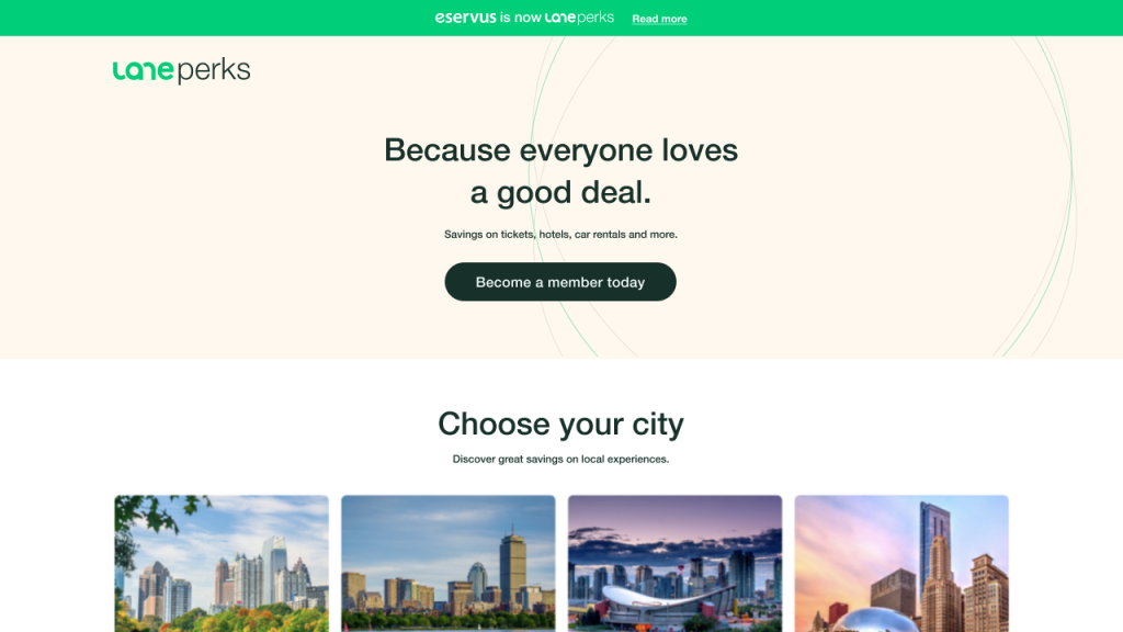
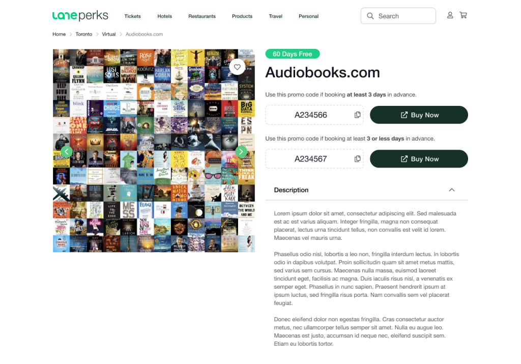
This service was rebranded as Lane Perks, and the new visual language was developed. The core team for this initiative was quite small and consisted of 2 program managers, a lead engineer, and a designer (myself). Once we established a logo, wireframes and website design, we worked with an external dev shop to build out our vision. The rebrand consisted of a new name, new logo, marketing website, and a brand new website for members to exclusively search for deals on travel, concerts, events, restaurants, etc.
Process: Logo design, workflows, wireframes, web design, front end implementation oversight, user testing and validation. In addition, marketing and brand design.
Tools: Figma, Miro, Adobe CC.
The name was established by a small team of 2 program managers, a copywriter, brand designer and myself. There was a tall list of names we came up with, but “Lane Perks” really communicated that feeling we wanted to evoke, users feeling a part of an exclusive community that receives deals and benefits.
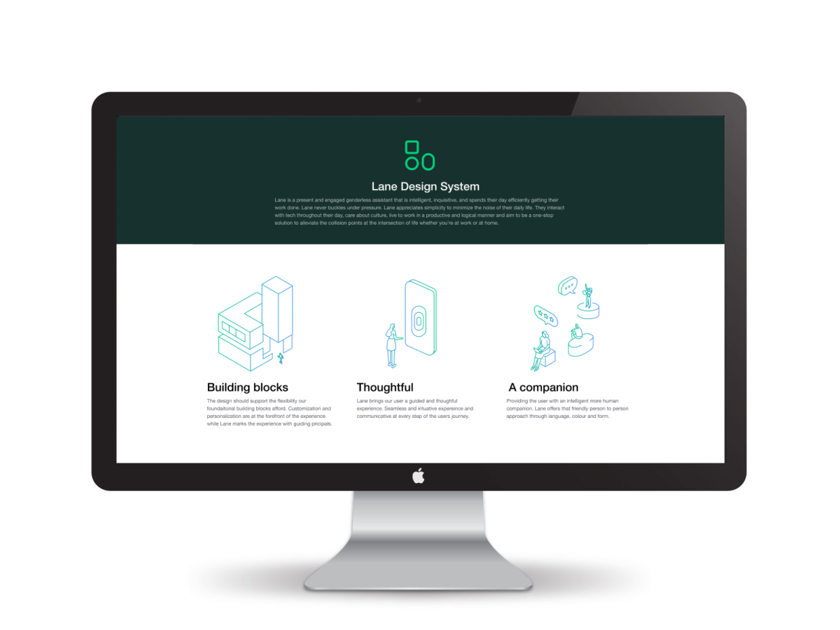
We needed to create funnels to attract property managers and individuals to opt into Lane Perks, so we created marketing pages for each type. Below is a mockup of the promotional site design specifically targeting property managers.
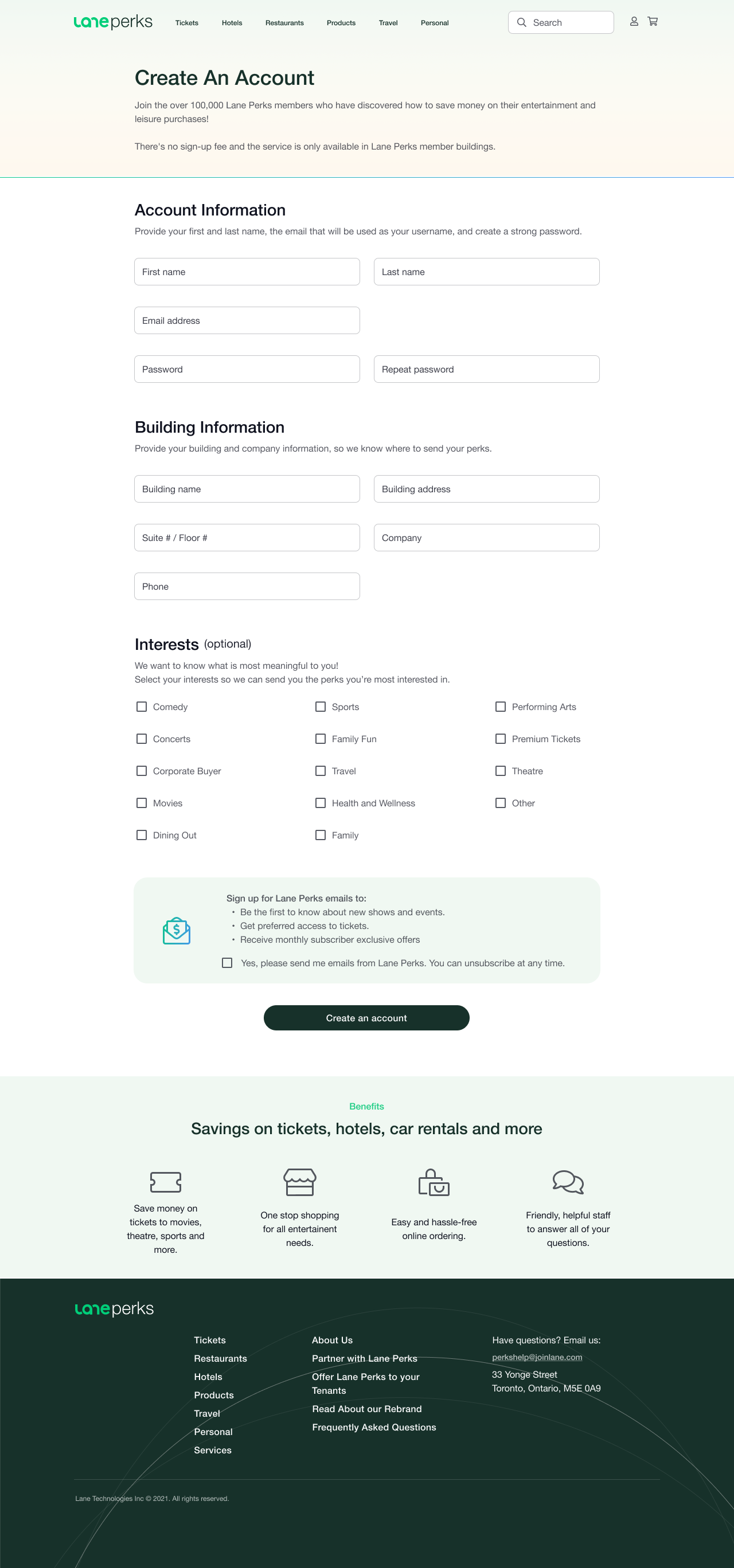
Once the user had opted to use the service, we required them to create an account to ensure we capture preferences of each individual user and allowed them to join the service.
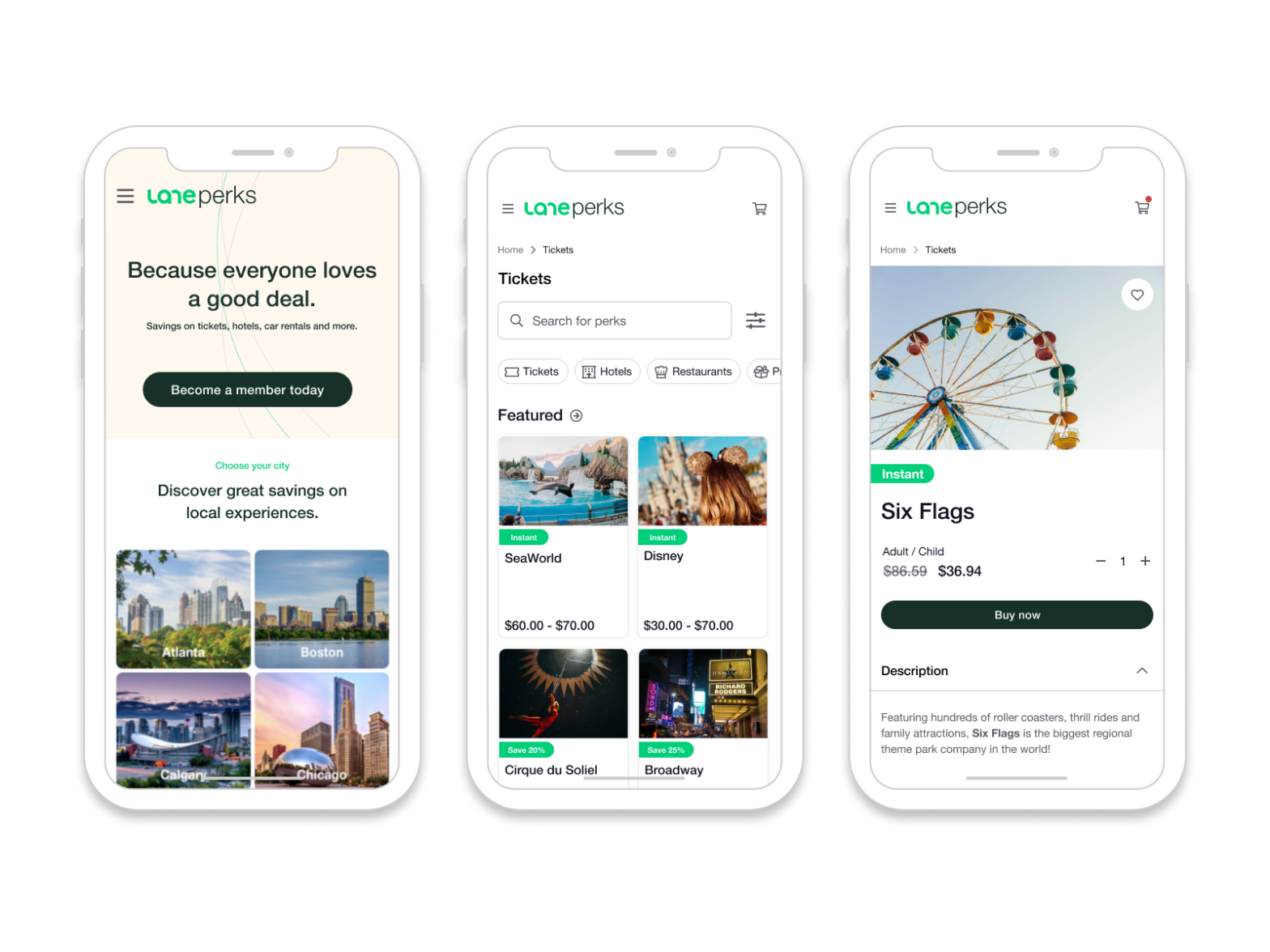
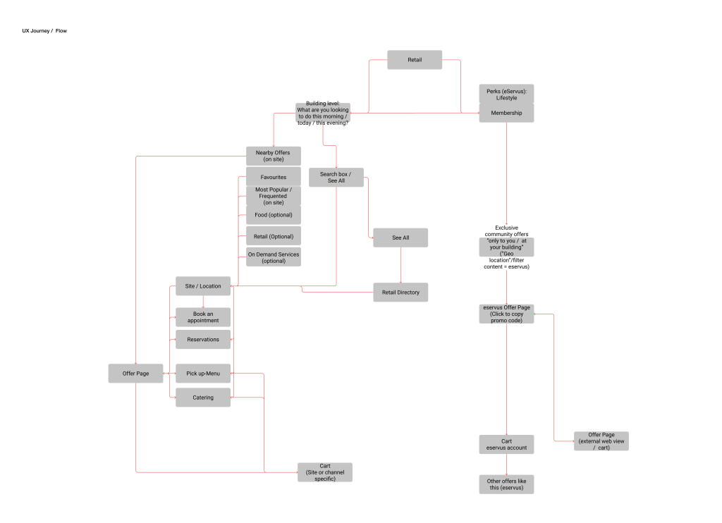
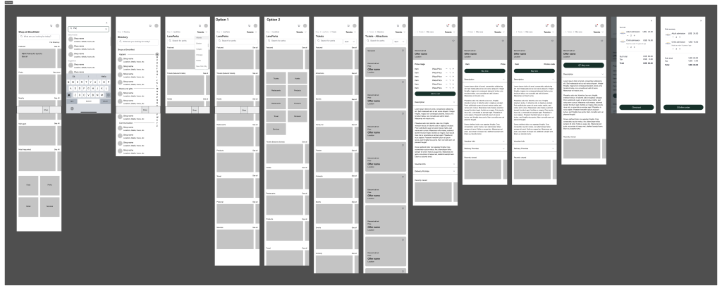
The following screens walks through the process of plotting out the Lane Perks website from a mobile first approach. First, a wire-flow was established so that we can organize the content for users and connect them to the experience directly from the Lane app.
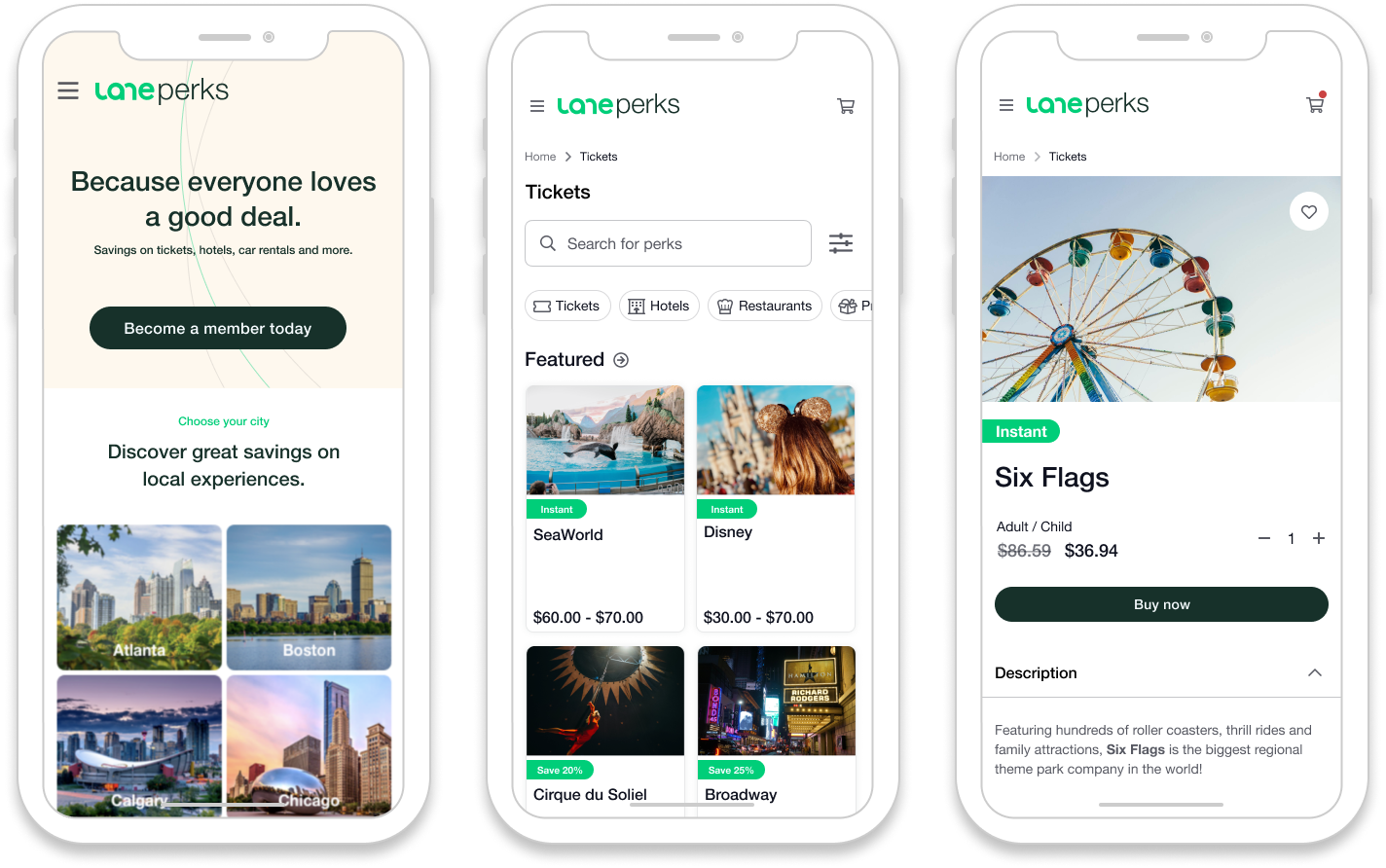
Lane contracted out the build to a development shop and the wireframes, flow and final designs were handed over to build out the screens. The few designs below are of the new Lane Perks website.
