Lane • Director of Product Design • 10 months (all phases)
Creating the foundation for rapid growth
Lane had a working app, but not a cohesive brand or design infrastructure. The product was held together by quick decisions and inconsistent patterns. When I joined as the design leader, the challenge was clear: build a design system and brand language from scratch that could support rapid scaling during a critical growth period. We had 12 months to establish the foundation before the company needed to be acquisition-ready.
Impact at a glance
- Design team scaled from 2 to 5+ designers
- Lane perks adoption increased 100% after applying new language
- Acquisition readiness achieved with cohesive design infrastructure
- Significant reduction in design and technical debt
The challenge
Lane’s brand was still finding its voice. The product looked functional but felt cold and transactional. The design infrastructure was minimal, which meant every decision had to be made from scratch. A few things needed to shift:
- No unified visual language or design principles across the product
- Early design debt making it hard to scale without friction
- Brand identity not clear enough to support growth or investment conversations
- Inconsistent component patterns slowing down development handoffs
- Design team was small and needed systems to scale faster
- No clear strategy for how design would evolve as the company scaled
The deeper problem was organizational. We needed to move beyond designing features and start designing the systems that would let the company scale confidently.
The strategy
I developed a two-part approach: first, establish a clear brand identity and visual language grounded in user research and company vision, then systematize it into a design system that could grow with the company.
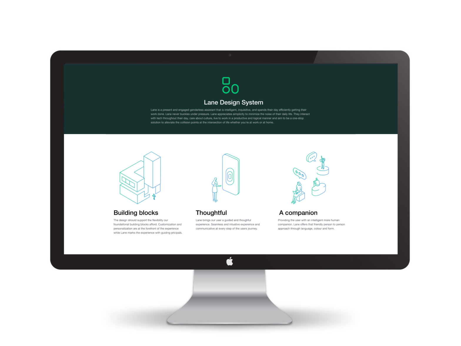
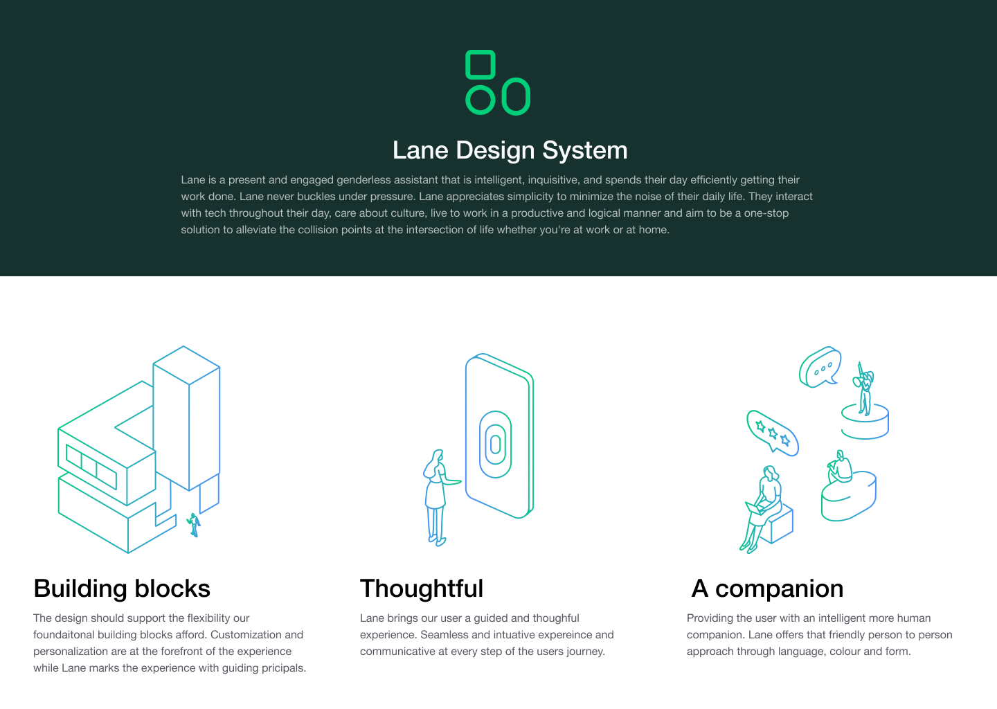
The brand strategy started with understanding Lane’s position in the proptech space. We defined personas for both property managers and tenants, and created a visual language that spoke to them directly: warmer, more human, less corporate. Curved lines, open typography, friendly messaging, and immersive imagery replaced the cold, rigid aesthetic of the original.
How we executed it
Brand strategy and research
I started with design sprints to explore the brand direction. We tested concepts with real users and stakeholders to validate that the visual language resonated. The goal was to create something that felt trustworthy to property managers but approachable to tenants. That tension shaped every decision.
Visual language development
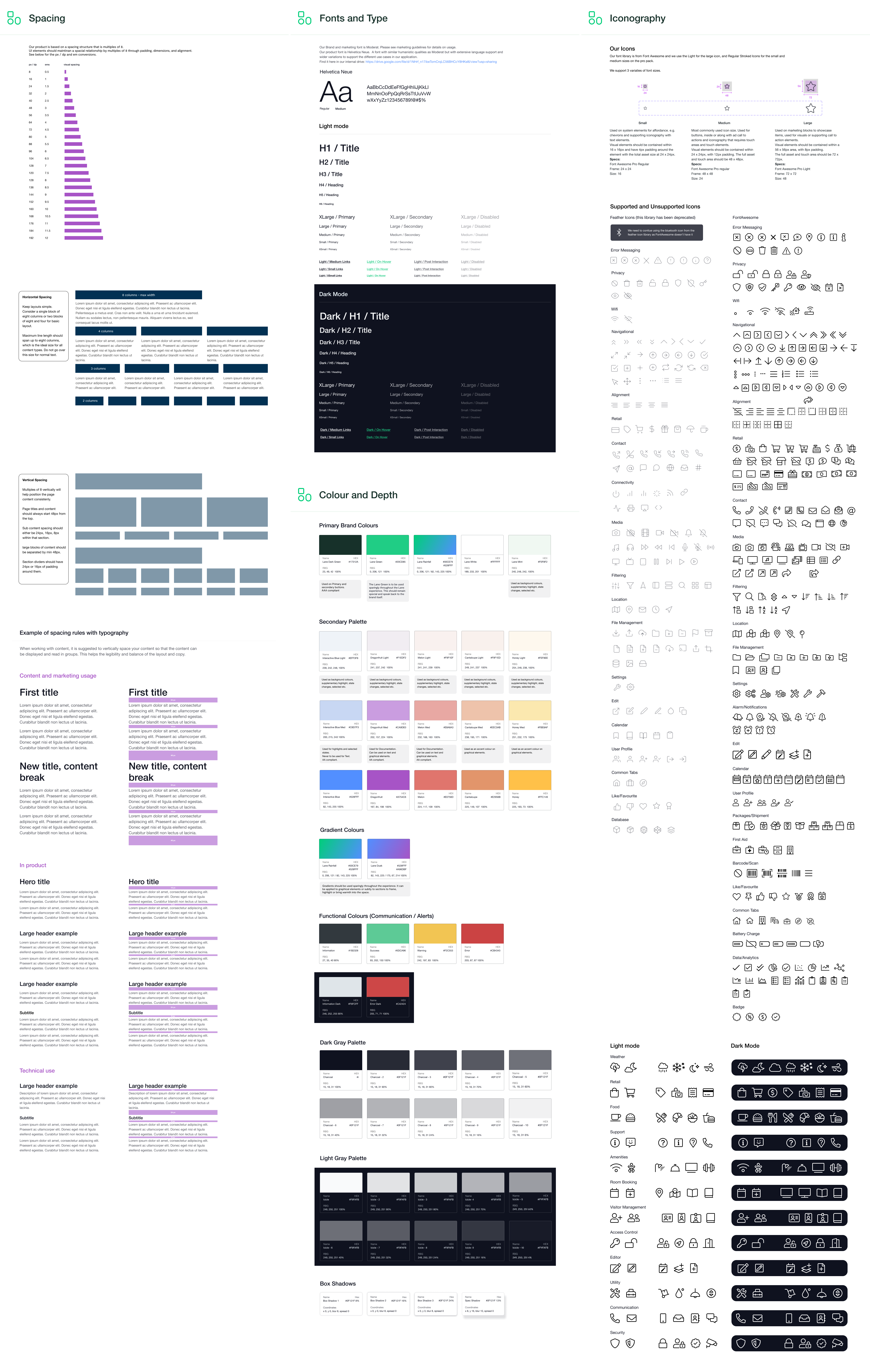
The new design language was more than aesthetics. It reflected company values: accessible, human-centered, forward-thinking. We established color palettes, typography systems, and iconography that could scale across multiple product surfaces and future use cases.
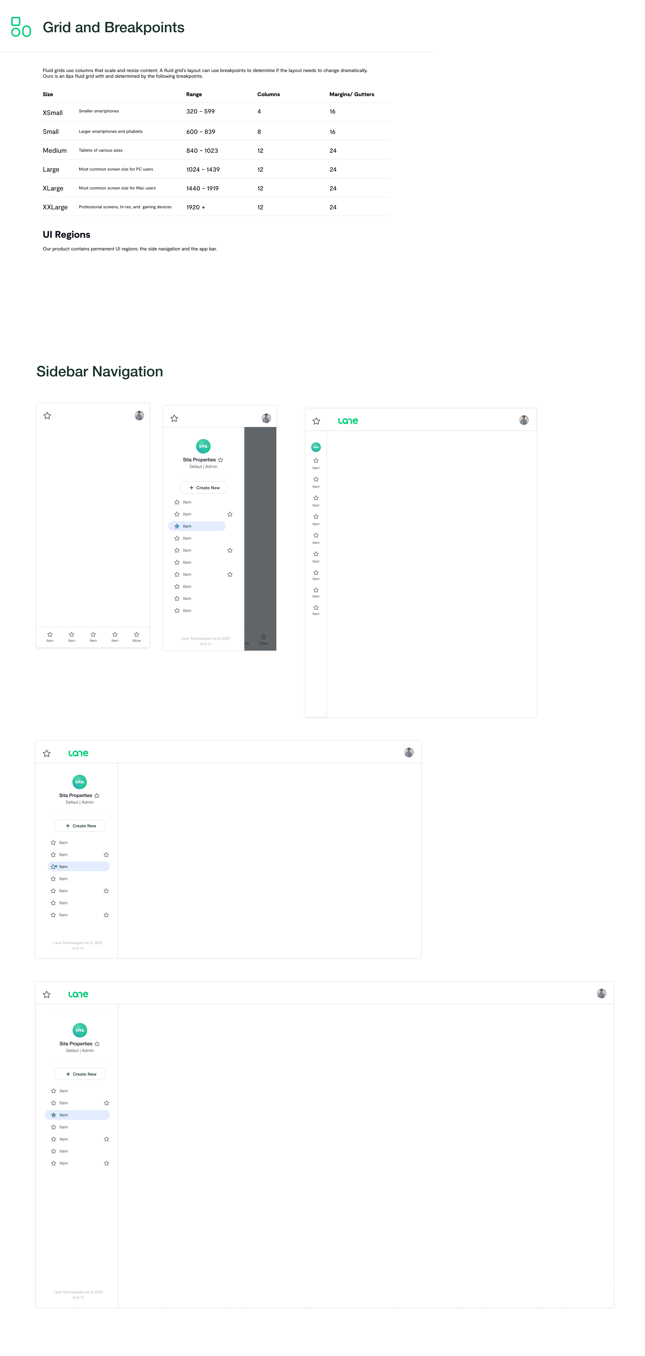
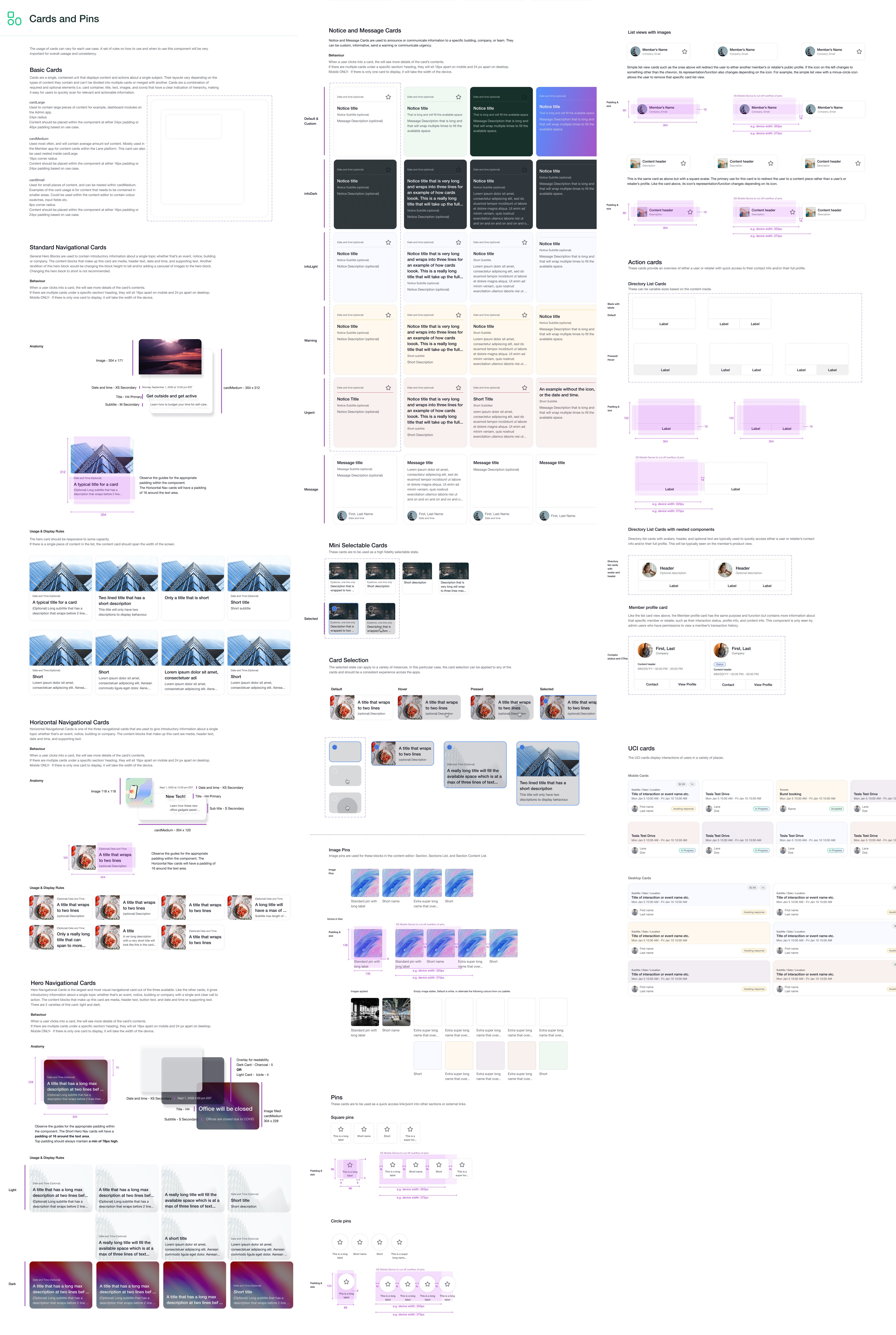
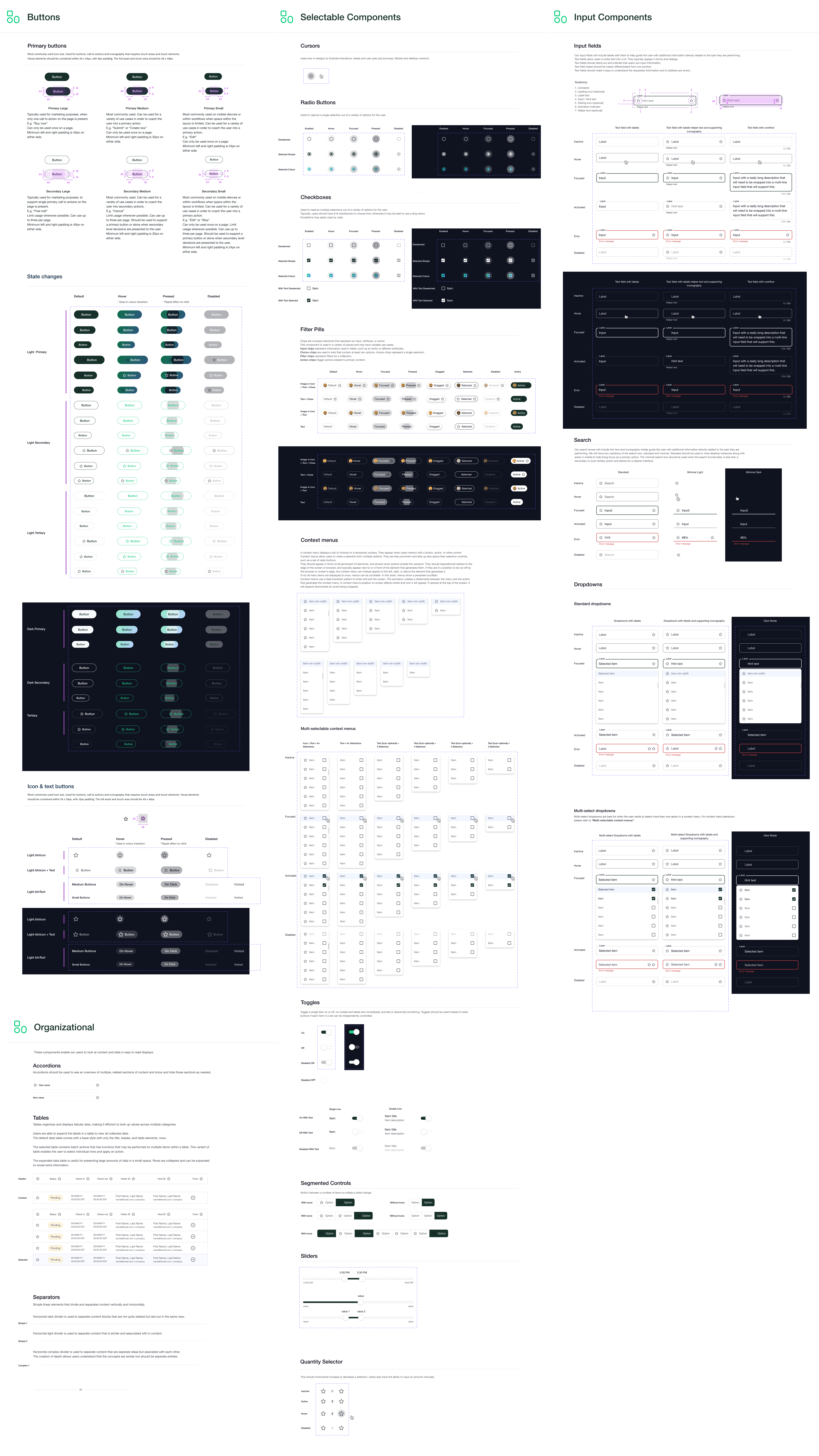
Building the system
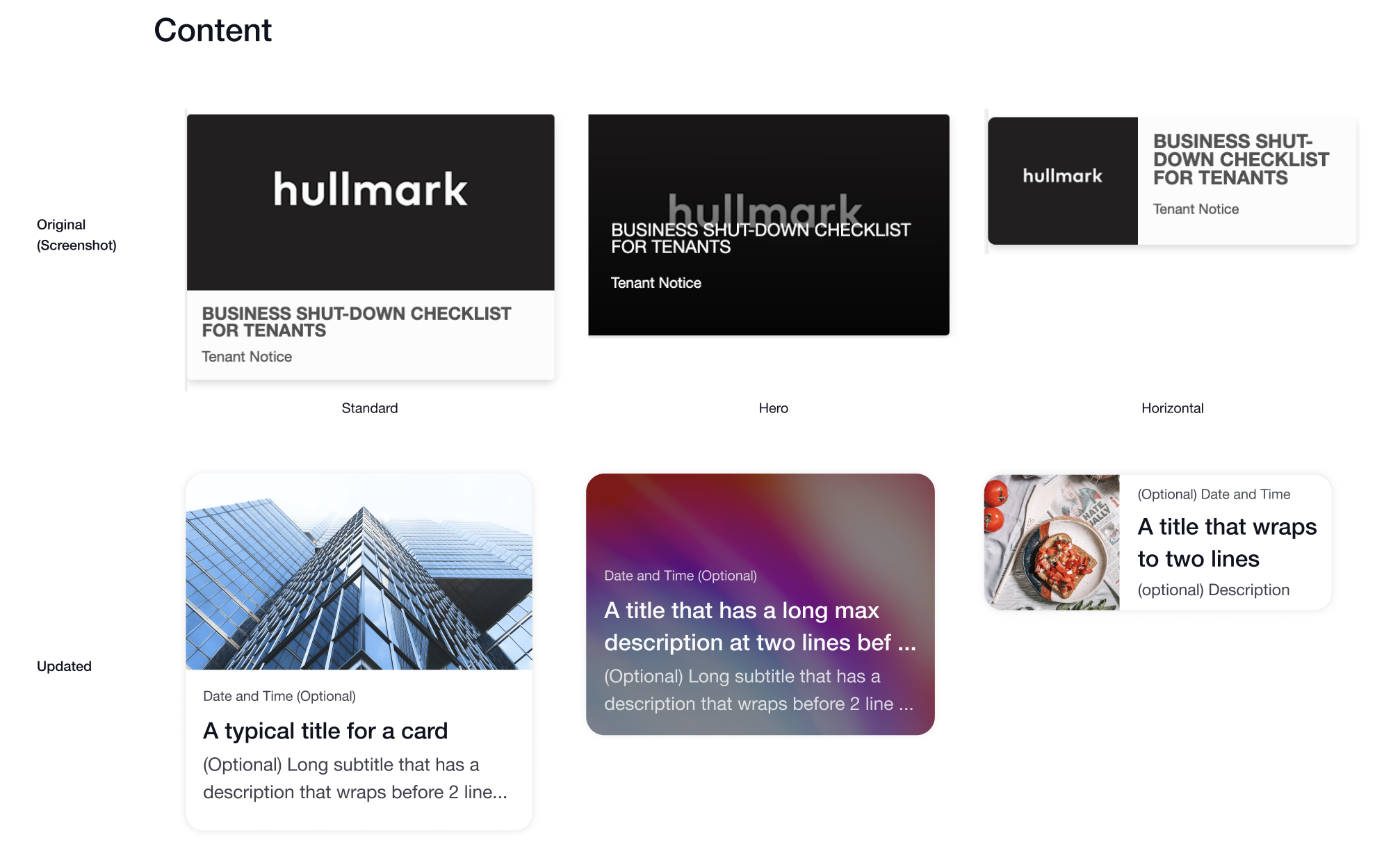
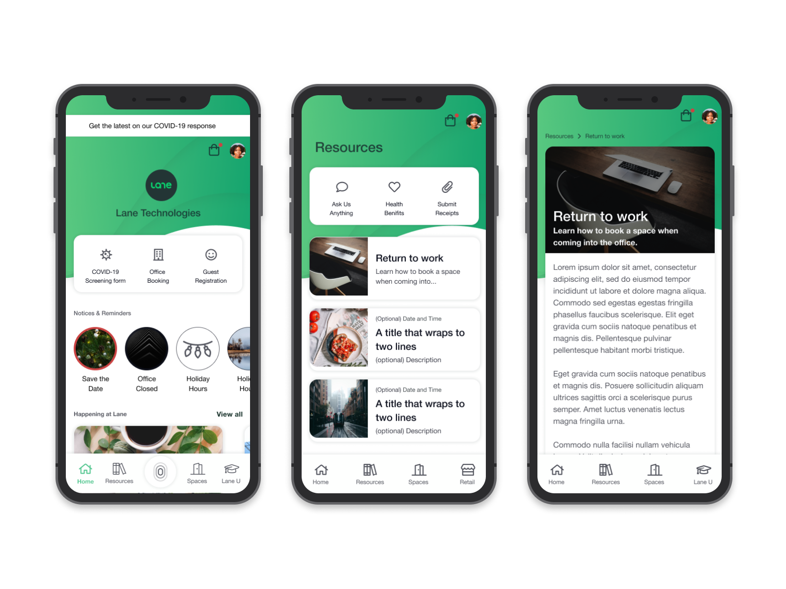
Rather than designing components in isolation, I mapped out the foundational layers first: grid systems, spacing, typography, color, and iconography. Then we built components on top of those foundations. This layered approach meant new team members could understand the logic and apply it to new patterns without constant oversight.
Distribution and adoption
I created comprehensive documentation in Figma and Storybook so engineers and designers could work independently. The system included not just components, but usage guidelines, dos and don’ts, and accessibility requirements baked in.
Supporting team growth
As we hired new designers, the system became our onboarding tool. New team members could understand Lane’s design language by studying the system, not by waiting for me to explain it. This let us scale the design team from 2 to over 5 designers without creating a bottleneck.
Library components
Below are the components and documentation created in Figma and distributed as the Lane Design System library for other teams to consume.