Mural • Lead Product Designer • 8 months
Making consistency a competitive advantage
Mural’s product had matured rapidly, but the design language hadn’t kept pace. Teams were working in silos, building components inconsistently, and the codebase reflected years of accumulated tech debt. We had a design opportunity wrapped inside an organizational problem: how do you introduce a cohesive visual language to a growing company while managing the complexity of multiple teams, platforms, and design patterns? The answer was Hana.
Impact at a glance
- 7+ product teams adopted the design system
- 200% improvement in feature design velocity
- Significant reduction in design-to-development handoff friction
- Enhanced accessibility compliance across the organization

The challenge
As Mural scaled, fragmentation was slowing us down. Designers on different teams were making inconsistent decisions. Developers were building similar components in different ways. Every new feature required negotiation about patterns and naming conventions. A few things were holding us back:
- No shared visual language or component taxonomy across teams
- Inconsistent design decisions duplicating effort and slowing releases
- Technical debt accumulating in code from ad-hoc components
- Limited accessibility governance, leaving compliance gaps
- Onboarding new designers took longer because patterns weren’t documented
- Brand identity wasn’t clearly expressed in the product experience
The result was a company that felt fragmented. We had a strong brand vision, but it wasn’t translating consistently to the product.
The strategy
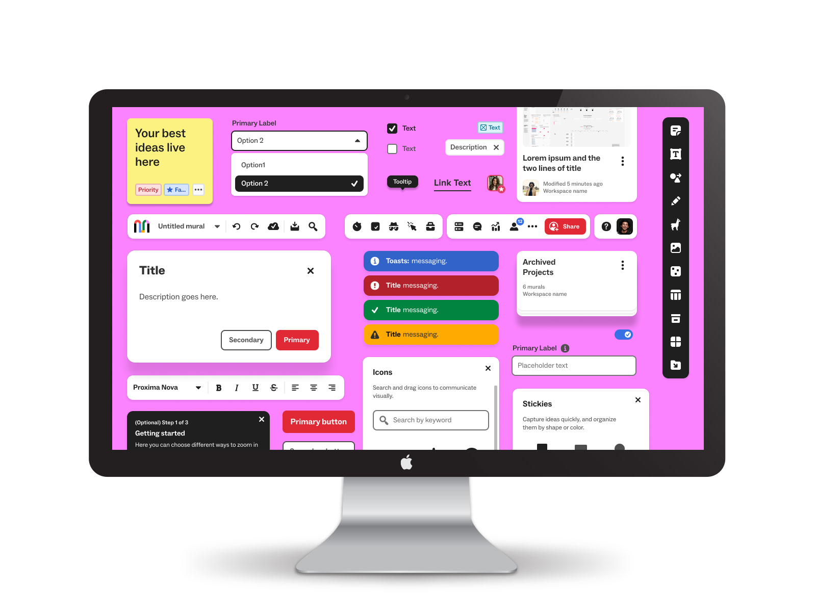
I led the effort to build Hana, a design system that would serve as both a visual language and an organizational tool. The name itself, a Hawaiian word for “happy work,” captured what we wanted to create: a collaborative environment where designers and developers could work faster and smarter together.
The vision was ambitious but pragmatic: establish a foundation of core components quickly, expand systematically, and create governance structures that would let teams contribute while maintaining consistency.
How we executed it
Audit and alignment
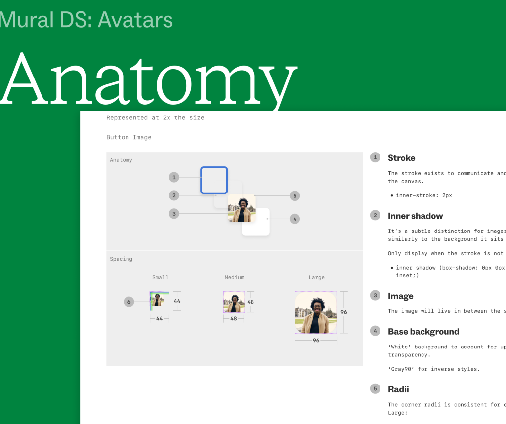
I started with a comprehensive system-wide audit of all existing components. We catalogued usage patterns, identified duplicates, and mapped dependencies. This gave leadership a clear picture of where we were and where we needed to go. It also became our roadmap.
Phased rollout strategy
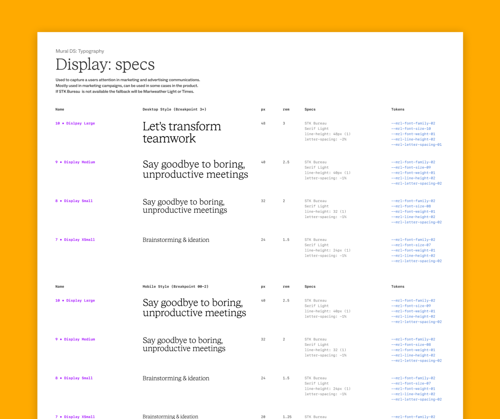
Rather than trying to build everything at once, we released in phases. First, fundamental components and tokens. Then progressively more complex patterns. This approach let us launch faster while building adoption gradually.
Distributed contribution model
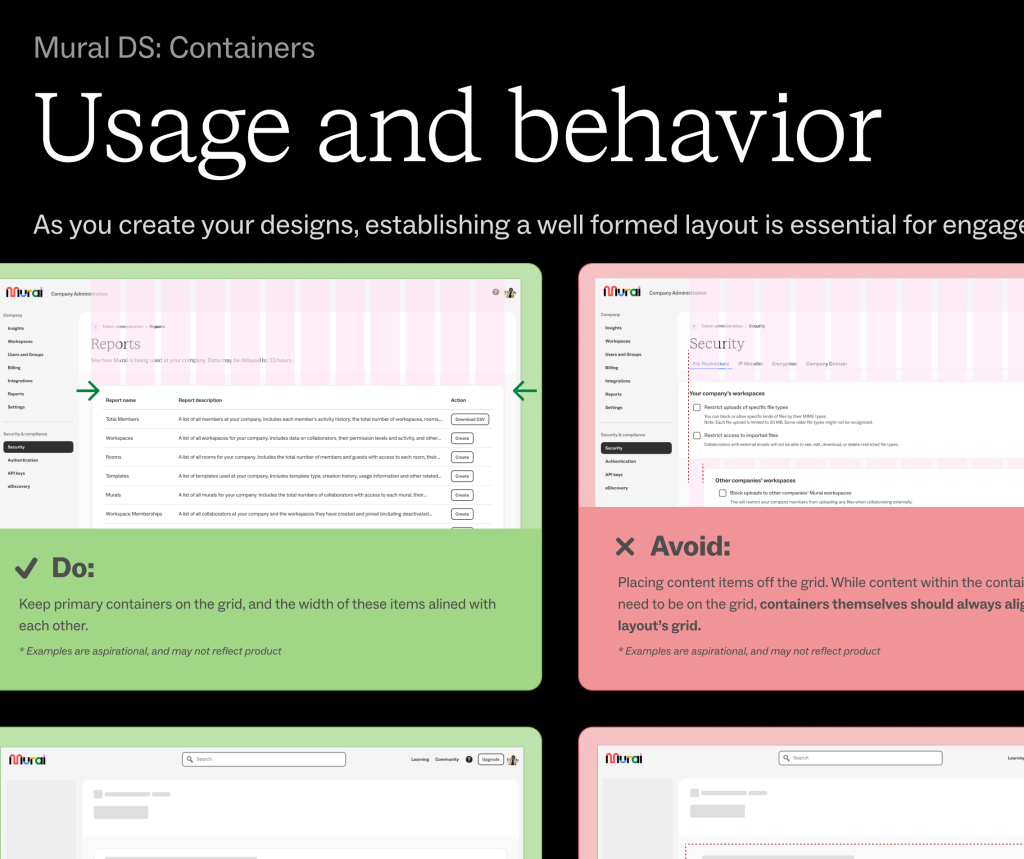
Not every component needed to live in the core system. I created a contribution framework that let other product teams build components for their features using our tokens and specs, then bring them into the system if they proved valuable. This kept us from becoming a bottleneck while maintaining quality standards.
Documentation for autonomy
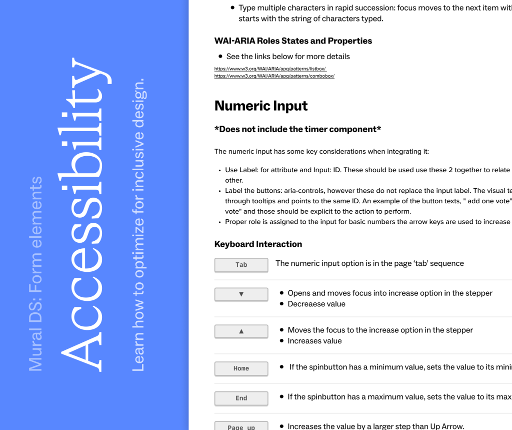
I invested heavily in detailed implementation specs, usage guidelines, and accessibility requirements. The goal was to give teams enough clarity that they could work asynchronously and confidently. We added office hours and design critiques to support adoption without creating dependency.
Governance without gatekeeping
We established review processes and accessibility standards without slowing teams down. The system became a conversation tool about quality, not a bureaucratic hurdle.
What happened
Velocity increased significantly
Teams could now reference existing components instead of redesigning patterns. Developers could grab tested code instead of writing from scratch. What used to take multiple rounds of alignment now happened in design reviews. Feature velocity increased by roughly 200% as teams spent less time negotiating and more time building.
Consistency became a brand strength
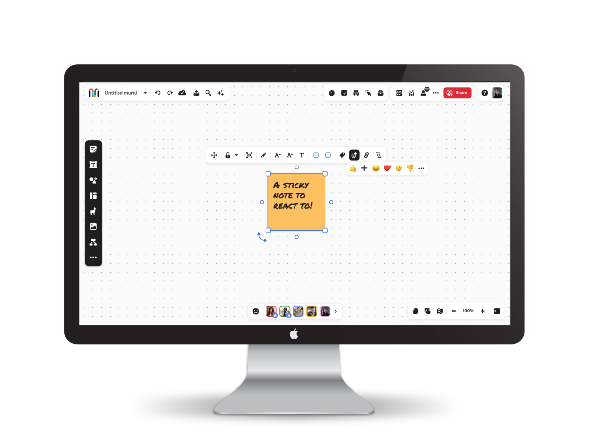
Hana’s visual language, with its bold, playful character, started showing up consistently across product. It reinforced who Mural was and created a cohesive experience that felt intentional, not accidental.
“The design system made us feel like we were working for the same product, not seven different products.”
- Senior Product Manager at Mural
Accessibility improved across the board
When we standardized components and added accessibility requirements at the source, compliance improved organization-wide. We could fix a pattern once and benefit everywhere it was used.
Beyond rebrand: A growth tool
Hana started as a vehicle for a rebrand and redesign, but it became something bigger. Teams used it to launch concepts quickly. Hackathons turned into fully functioning features because the foundation was solid. New designers onboarded faster because patterns were documented.
Reflection
Building a design system is partly a design problem and partly an organizational change problem. The hardest part wasn’t designing the components, it was creating a contribution model and governance structure that felt empowering instead of restrictive.
What worked was treating the design system as a product with its own users (designers and developers), its own roadmap, and its own need for continuous feedback. We listened when teams said something wasn’t working. We iterated on processes as adoption patterns emerged. The system succeeded because it served the organization, not the other way around.
This project reinforced that design systems are strategic tools. They’re not just about consistency, they’re about enabling teams to move faster, reducing decision fatigue, and embedding your product values into every interface. Done right, a design system becomes invisible to users but essential to the organization building the product
