Lane for Shopify • Director of Product Design • 3 months
Designing coordination at scale
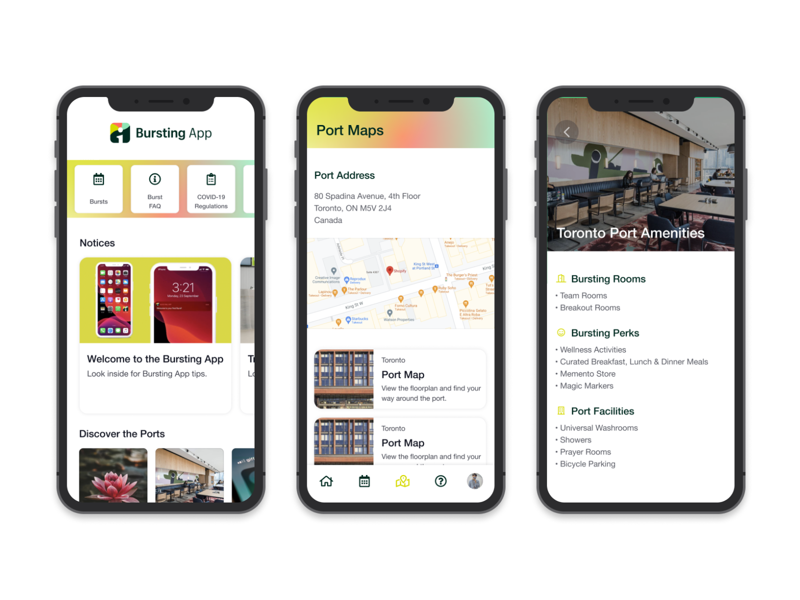
Shopify wanted to transform how their distributed teams gathered for in-person events, which they call “bursts.” These weren’t small meetups. They were global, multi-day events with dozens of attendees across various roles and responsibilities. The challenge: design a platform that let organizers manage complexity while keeping participants engaged and informed, all from mobile devices scattered across cities and time zones.
Impact at a glance
- Multi-role coordination across organizers, participants, and venue management
- Global event scale supporting distributed teams across locations
- Mobile-first approach prioritizing on-the-go access for attendees
- Successful delivery of complex multi-stakeholder product in partnership with Shopify
The challenge
Event coordination is inherently complex. Shopify’s bursts involved dozens of moving pieces: invitations, RSVP management, room bookings, meal scheduling, local recommendations, and real-time updates across time zones. The traditional approach would have built a desktop-first admin tool with a companion mobile app. But Shopify’s teams needed to coordinate and participate entirely from mobile.
The core problems we had to solve:
- Organizers needed full event management capabilities on mobile without overwhelming the interface
- Participants needed a lightweight experience that kept them informed and engaged
- Multiple user roles (organizers, team leads, attendees) needed different but interconnected workflows
- Coordination across time zones and locations required clear communication and real-time visibility
- Booking logistics (rooms, meals, activities) had to feel effortless, not transactional
- The experience had to work seamlessly when organizers and participants were offline then reconnected
The approach
Rather than treating this as a straightforward mobile app, we approached it as a coordination system. The design had to support different user roles and their distinct needs while creating a coherent experience across the entire event lifecycle.
How we executed it
Stakeholder alignment and research
I led workshops with Shopify’s event leadership team to understand their pain points with existing tools. They were using multiple disconnected platforms: email for invitations, Slack for coordination, Google Calendar for scheduling, mapping apps for local recommendations. The goal was to consolidate that complexity into one seamless experience.
Multi-role workflow design
The hardest part was designing for three distinct user types with overlapping needs. Organizers needed full control and visibility. Team leads needed to manage their groups. Attendees needed clarity without noise. I created separate but connected user journeys for each role, then stress-tested how information flowed between them.
Information hierarchy on mobile
Mobile forced us to be ruthless about prioritization. We couldn’t dump all event information on the screen. Instead, we sequenced the experience chronologically: pre-event setup, arrival coordination, real-time participation, and post-event. Each phase showed only the information relevant to that moment.
Complex workflows made simple
Tasks like inviting guests, booking rooms, scheduling meals, and browsing local activities could easily have become clunky. We designed each workflow to be progressive disclosure: show the simplest version first, then reveal options as needed. This kept the interface clean while maintaining power.
Desktop support without complexity
While mobile was the priority, organizers needed a desktop view for planning. We designed the desktop experience as an extension, not a separate product. The same data model, same visual language, same workflows. But the desktop gave space for broader views and bulk operations that didn’t make sense on mobile.
Collaborative design with engineering
I worked closely with the engineering team to understand technical constraints and opportunities. This wasn’t a waterfall handoff. We iterated together, refined based on what was feasible, and made decisions that were both delightful and buildable.
What happened
A platform that scaled with the event
The product handled everything from invitation to post-event summary. Organizers could manage the full event lifecycle on their phone. Participants always knew what was happening and where they needed to be.
Reduced coordination friction
By consolidating what used to be five different tools into one experience, Shopify teams spent less time figuring out logistics and more time actually connecting at the event.
“The app made me feel like I wasn’t going to miss anything. I knew when to show up, where to be, and what was happening next.” Shopify participant, post-event feedback
Successful cross-company collaboration
Working closely with Shopify’s product and events leadership meant we built something that truly solved their specific context, not a generic event app. That partnership model became a template for future Lane and Shopify work.
Mobile-first validation
This project proved that complex coordination workflows could live on mobile with the right design approach. It challenged the assumption that power features require desktop.
NOTE: For the video’s best experience, view at full screen at 2x
Reflection
This project taught me that the hardest design problems aren’t about individual features, they’re about orchestrating complexity across multiple user roles and workflows. The success wasn’t that we made a nice mobile app. It was that we created a coherent system where organizers, team leads, and attendees could all accomplish their goals in one platform.
What worked was leading a collaborative design process with both Shopify and our engineering team. We weren’t handing off designs and waiting for feedback. We were making decisions together, challenging assumptions, and iterating based on what we learned. That partnership approach is what made the platform actually work at scale.
The other learning: constraints breed creativity. Designing for mobile first forced us to think clearly about what mattered and what was noise. If we’d started with desktop, we probably would have built something heavier and more complex. Mobile forced us to simplify.