Mural • Lead Product Designer • 2 months
Making 12 seconds feel like 1
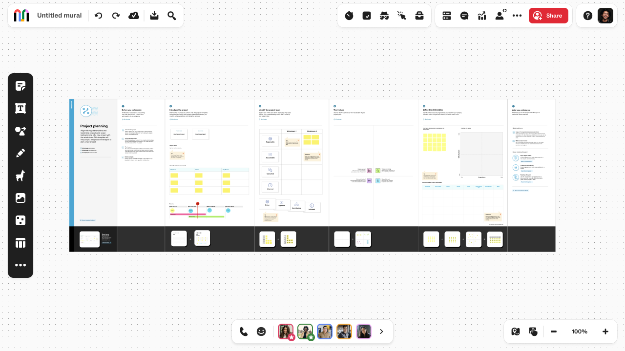
When users opened a large mural, they hit a wall. The legacy loading screen could stretch up to 12 seconds on complex canvases with multiple collaborators, and the experience felt like a dead stop. Users were stuck staring at a splash screen with generic tips and no sense of progress or control. The psychological weight of that wait time was real, and it was costing us engagement.
Impact at a glance
- 49% improvement in perceived load time
- 1.24 seconds average reduction from baseline
- 51% of murals now load content in under 1 second
- Significant increase in user confidence and delight
The problem
The core issue wasn’t just technical, it was psychological. Users couldn’t do anything while waiting. The legacy splash screen created a moment of helplessness where they had no sense of progress, no visibility into what was loading, and no way to interact with the product. A few things stood out:
- Users felt stranded on a static splash screen with no indication of progress
- Large canvases with complex permissions had unpredictable load times
- The experience felt outdated compared to how other collaborative tools handled loading
- Users had no sense of control or visibility into what was happening behind the scenes
- Each wait reinforced the perception that the product was slow, even when the actual load time was acceptable
The result was a loading experience that broke momentum and made the product feel clunky before users even got started collaborating.
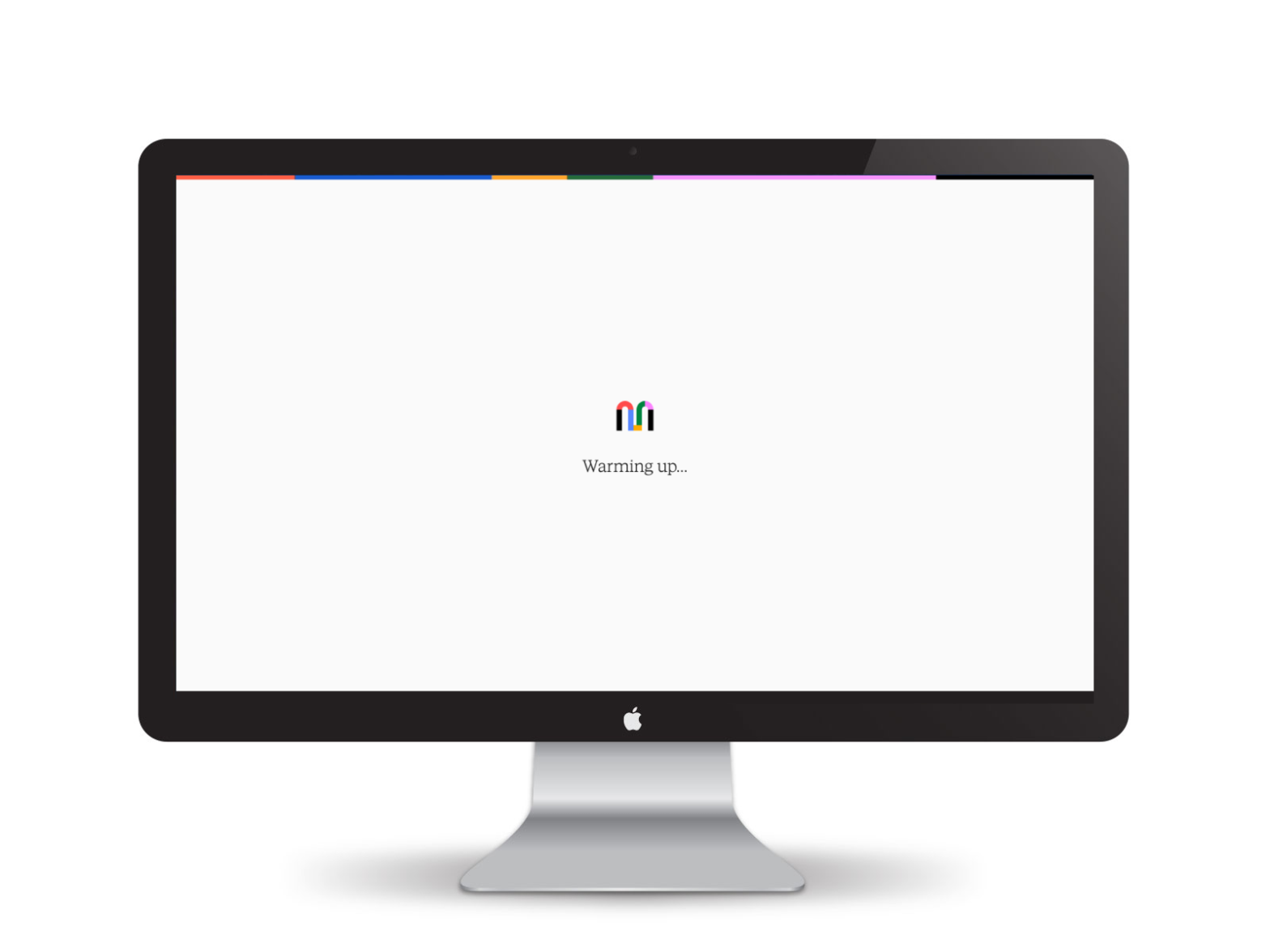
The solution
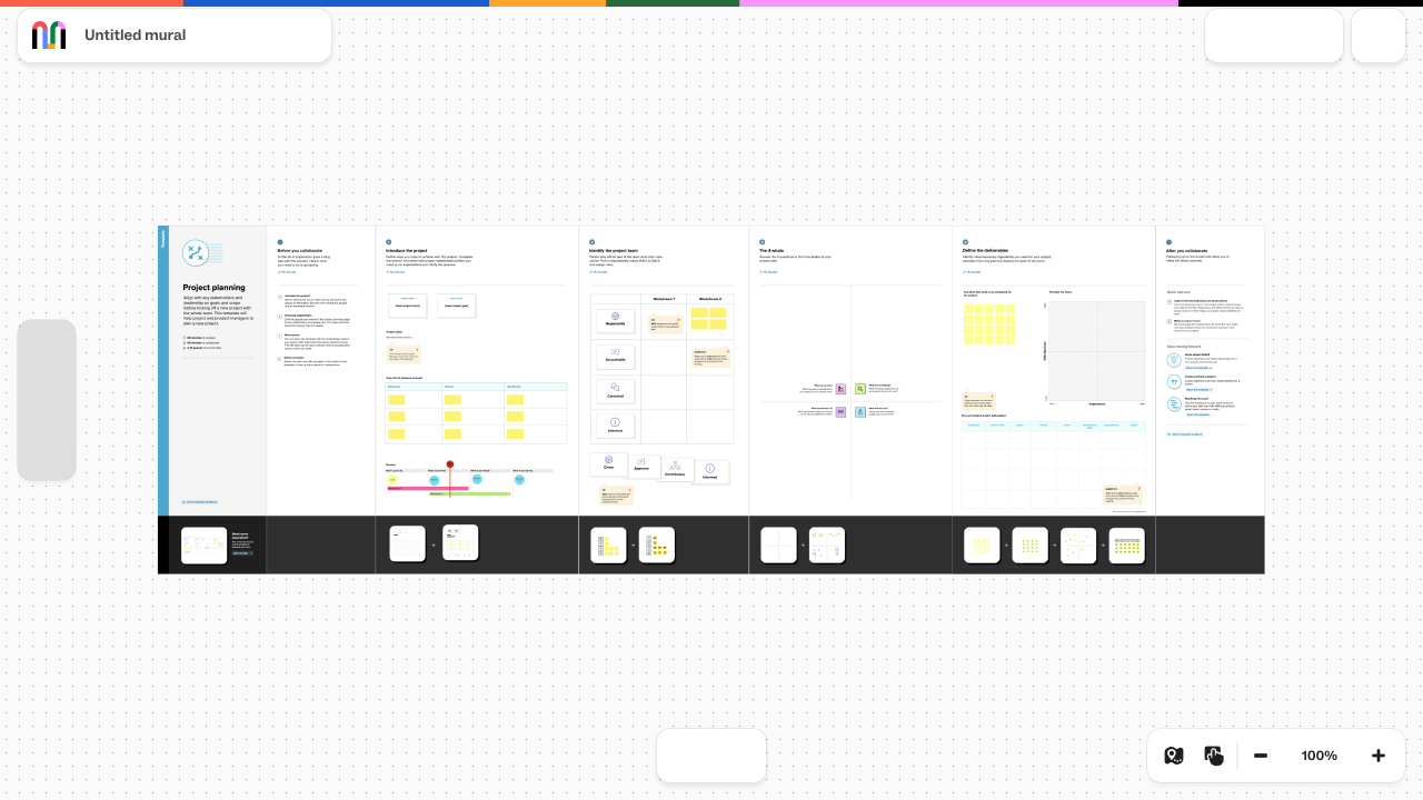
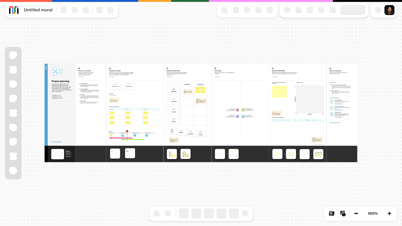
Instead of hiding the complexity behind a static screen, we made the loading process visible and interactive. We introduced a phased loading approach that brought content into the canvas progressively, giving users something to see and do immediately while backend operations finished in the background.
The strategy was simple: show the canvas structure first so users could navigate immediately, then layer in permissions and tooling as those checks completed, all while maintaining visual consistency and respect for accessibility needs.
How we approached it
Research and competitive analysis
I started by studying how 12+ competitors in the collaborative tooling space handled loading. The pattern was clear: the best experiences used a phased approach, mixing technical necessity with perceptual design. Loading wasn’t just about making things faster, it was about making the wait feel intentional and managed.
Orchestrating the phases
I mapped out the load sequence based on user priority and technical constraints. The first phase showed the canvas and navigation immediately so users could explore. The second phase brought in the toolbar and collaboration features. The third phase loaded permissions and enabled advanced tools. Each phase was choreographed with motion and visual feedback to feel purposeful, not like a glitchy unfinished state.
Designing for all users
Not all users had the same permissions or needs. I had to account for different permission levels, with certain tools staying disabled until their permission checks came back. I also designed for accessibility, including reduced motion alternatives and adjusted animation transition rates for photosensitivity.
Testing and iteration
We user tested multiple versions, measuring perceived speed, technical speed, and overall delight. Each iteration refined the visual language, timing, and feedback mechanisms until we landed on an experience that felt fast and intentional.
What happened
Users saw content faster
The new experience reduced perceived load time by 49%. More importantly, 51% of murals now show content in under 1 second. Users who previously had to wait 8-12 seconds now see a working canvas almost immediately.
Confidence and momentum
When users could navigate and see the canvas right away, the entire experience shifted. They felt in control. They weren’t stuck waiting on a splash screen wondering if something was broken.
“The new loading experience makes me feel like the product is responsive and modern. It actually feels fast now.”
- Design Director at a Fortune 500 tech company
Measurable engagement lift
When users didn’t lose momentum during load, they were more likely to start collaborating immediately and spend longer in the canvas. The experience set a better tone for the rest of the session.
Reflection
This project taught me that performance design isn’t just about speed, it’s about perception and psychology. The technical work happening in the backend was important, but the design work of making that invisible work visible was what actually moved the needle on user experience. It’s a good reminder that sometimes the biggest impact comes from designing the transitions between states, not the states themselves.
It also reinforced the value of competitive research and user testing. The phased approach wasn’t revolutionary, but it was the right solution for our context, and we only knew that by looking outward and testing with real users.