Smart Brief
Shutterstock Custom • Lead Product Designer • 3 months
Reducing friction at the point of clarity
Fortune 500 brands came to Shutterstock Custom to create premium content. But the process started with a brief. Clients filled out open text fields with no structure, forcing Shutterstock’s internal team to transcribe and translate those briefs into content creator-friendly versions. This transcription step was a bottleneck that cost time and introduced errors. The real problem: clients didn’t know what information they actually needed to provide, and creators didn’t get the clarity they needed to execute well.
Impact at a glance
- 1 week down to 15 min average time to complete a brief
- Eliminated transcription step reducing operational overhead
- Higher quality briefs leading to fewer revisions and better outputs
- Faster creator onboarding through clearer direction
The challenge
The old briefing experience was essentially a form dump. Clients faced dozens of open text fields with minimal guidance. They didn’t know what mattered or how much detail to provide. The results were inconsistent: some briefs had too little information, others were overwhelming with irrelevant details. Internal teams then spent hours translating these briefs into actionable documents.
The deeper issue was structural. The brief was the contract between client and creator. If it was unclear, the entire project suffered.
The strategy
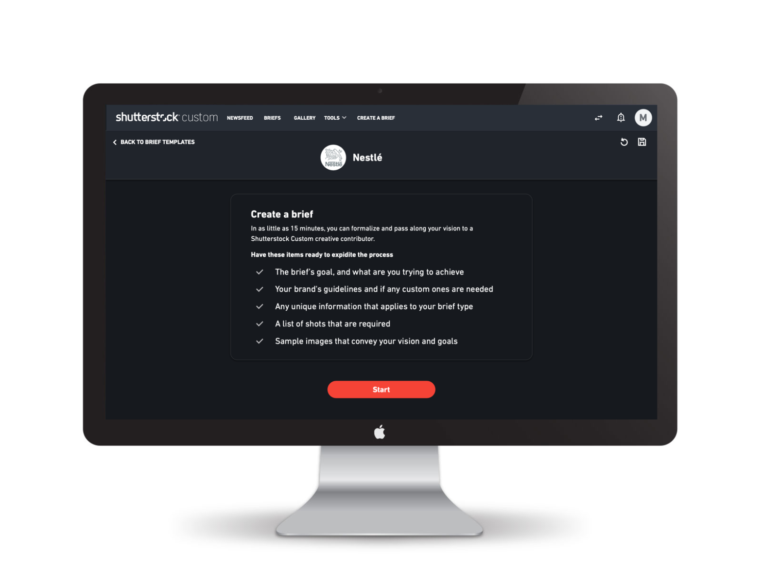
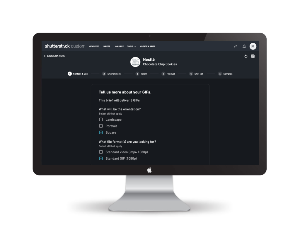
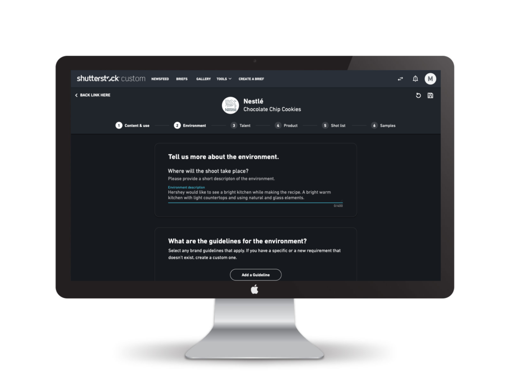
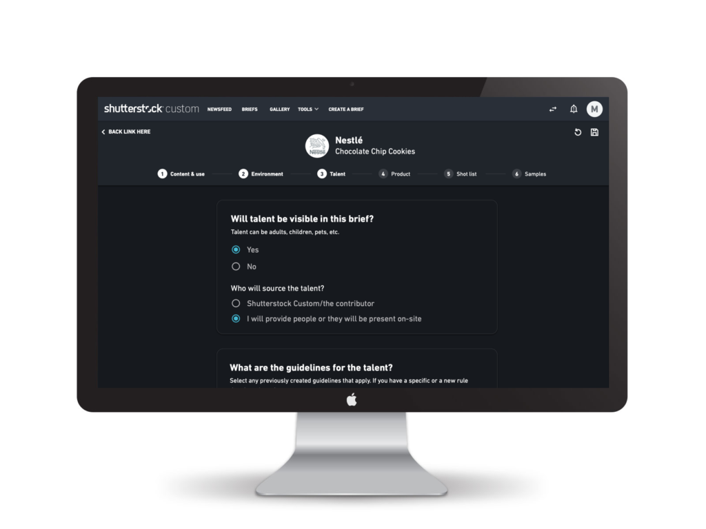
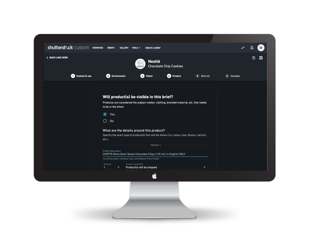
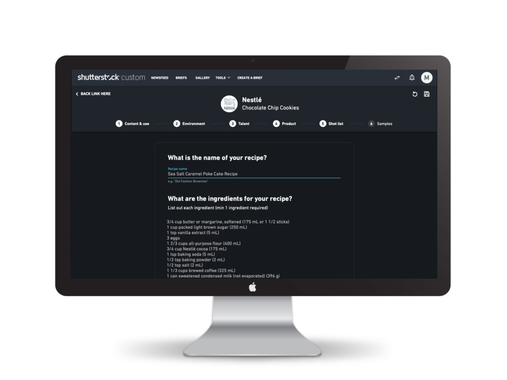
I designed a conversational briefing experience that guided clients through the information they actually needed to provide. Rather than a form, it was a dialogue. Each section had a clear purpose, examples, and contextual help. The structure reflected how creators actually thought about projects: goal, content, environment, talent, products, shot list, and inspiration.
How we executed it
Research on both sides
I interviewed clients about their process and frustrations. Then I talked to creators about what information they actually needed to execute well. The gap was clear: clients didn’t know what creators needed, and creators felt like they were deciphering riddles from briefs.
Conversational structure
Instead of a form, we designed a step-by-step experience that felt like a conversation. Each step had context about why the information mattered. We added examples showing what good responses looked like. This reduced decision fatigue and helped clients provide useful information on the first pass.
Operational design
The structure we created was designed to be machine-readable. Each field mapped to data that creators needed. No transcription required. This eliminated a step that was costing Shutterstock time and introducing errors.
Progressive complexity
We started simple, then revealed more specific questions as clients progressed. Advanced options for brands who needed them, clear defaults for everyone else. This kept the experience approachable without losing power.
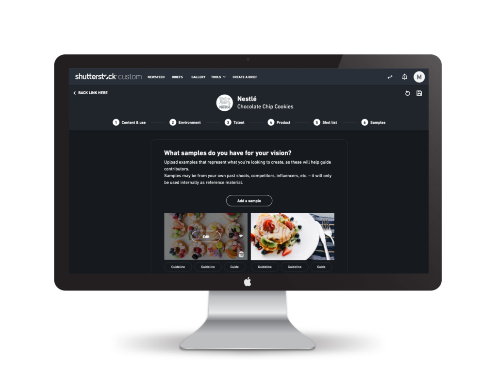
Inspiration and clarity
We added a section for clients to upload sample images and mood boards. This gave creators visual direction they couldn’t get from text alone.
What happened
Time collapsed
Clients went from a week to as little as 30 minutes to complete a brief. The structure meant they didn’t second-guess what to include or waste time on irrelevant details.
Transcription disappeared
The structured data eliminated the need for internal teams to translate briefs. That was significant operational savings that scaled with volume.
Fewer revisions
Creators got clearer direction, which meant fewer back-and-forths during execution. Projects moved faster and produced better results.
“For the first time, I felt like the creator actually understood what I was trying to do. The brief was clear.” Marketing manager from Nestle, briefing research
Easier client onboarding
New clients could complete a brief without needing a walkthrough from Shutterstock Custom’s team. The conversational interface guided them naturally through the process.
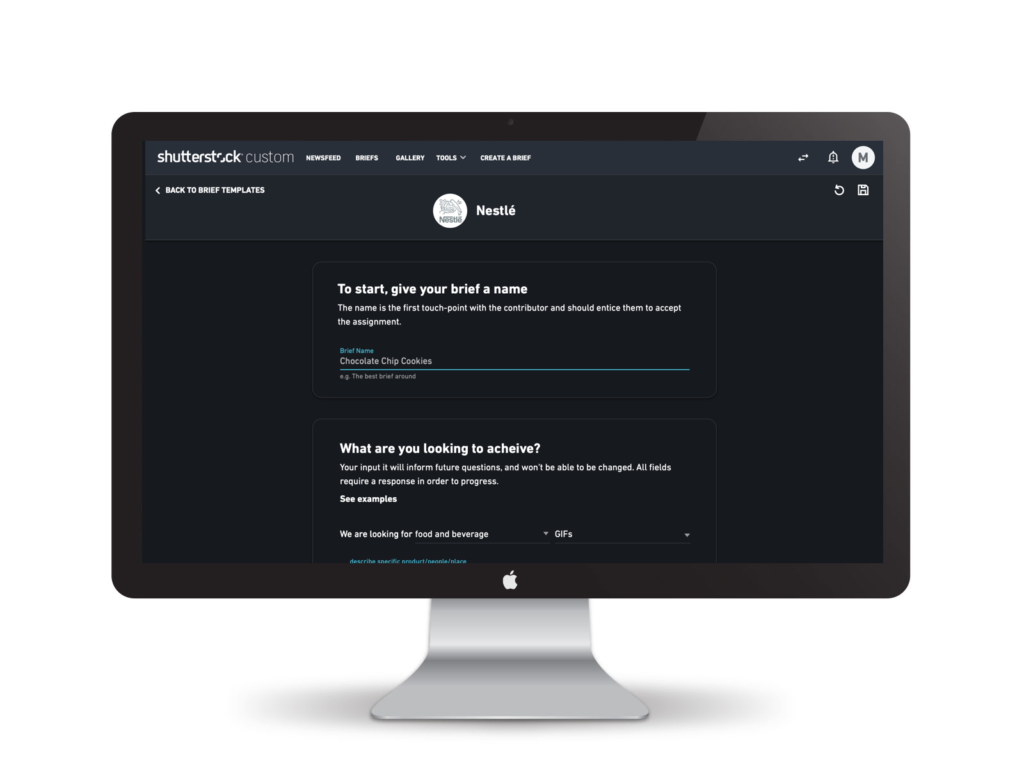
The content. What are you looking to get and how will it be used.

Reflection
This project showed me that operational design is as important as user experience design. A better brief didn’t just feel better to use, it eliminated downstream friction that cost the company time and money.
What worked was designing for both sides of the workflow. We made the client experience better, but we also designed the data structure to eliminate a transcription step. The best design serves multiple stakeholders at once.
The other insight: clarity at the point of input compounds. When clients provided better briefs upfront, creators executed better, projects moved faster, and quality improved. One well-designed step early in the workflow can eliminate multiple painful steps later.
For enterprise product design, this was a reminder that sometimes the highest-impact work is unglamorous. It’s not about new features, it’s about eliminating friction and making existing workflows seamless.