Workera • Principal Product Designer • 3 months
A design system built to close the gap between how Workera looked, how it should have felt, and what it actually cost the business to keep those two things apart.
The problem
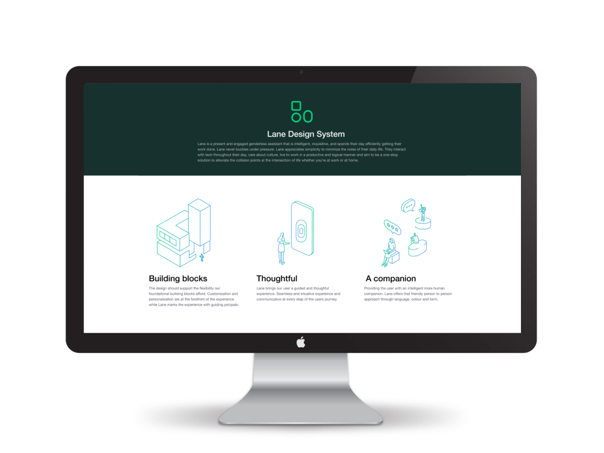
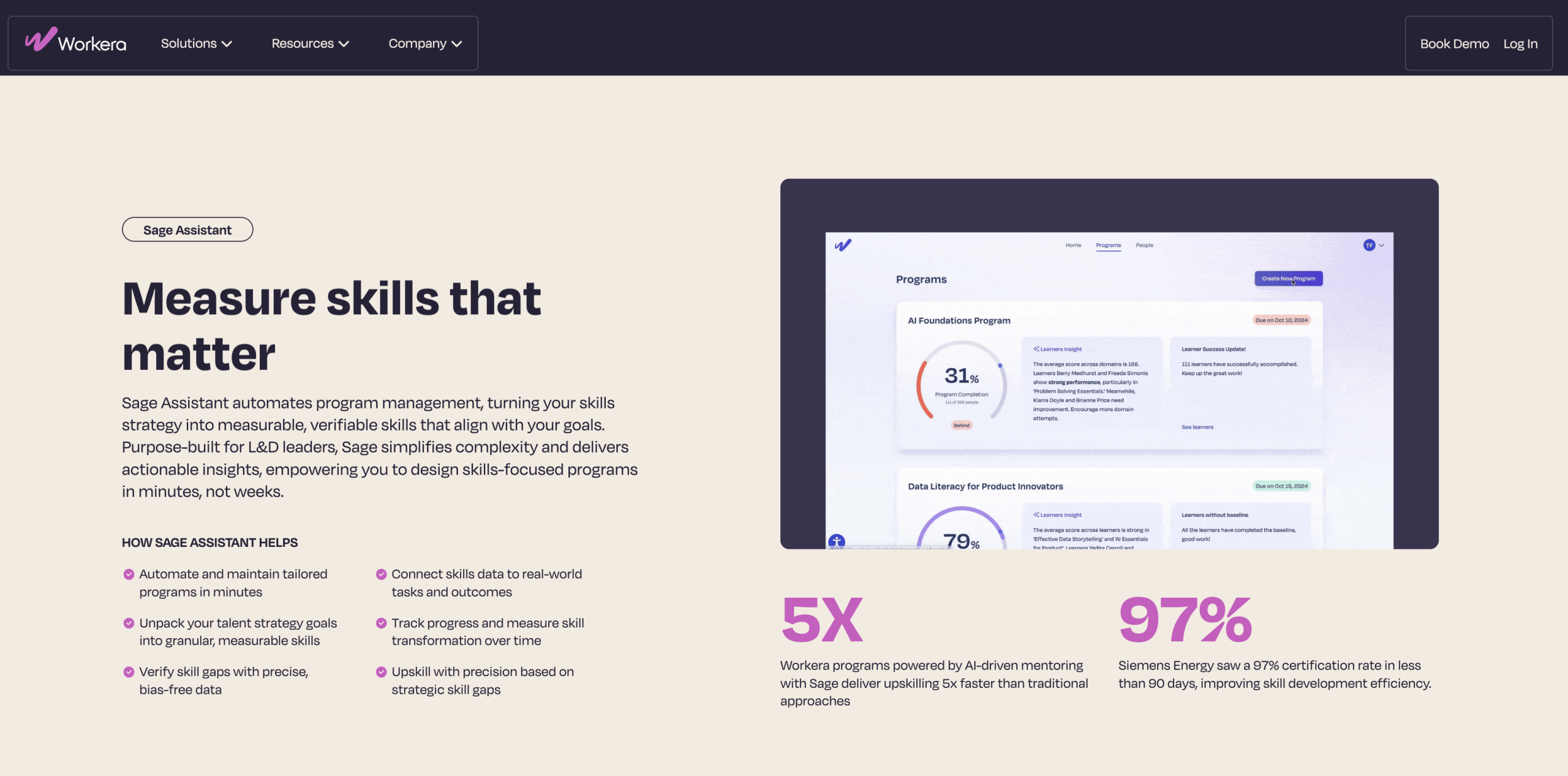
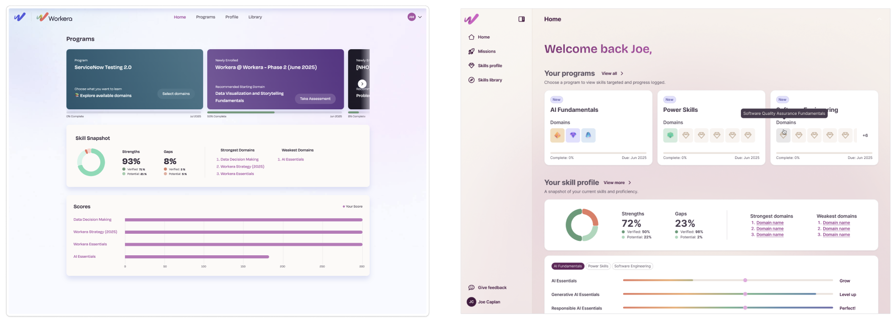
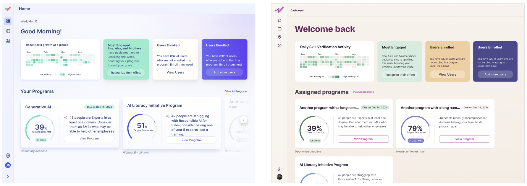
Product and marketing at Workera had drifted into two different visual languages, with no shared system holding either one together. That split was more than a cosmetic issue. It meant the experience of Elo, our AI guide and the closest thing the product had to a brand ambassador, was inconsistent depending on where a user encountered it. It also meant real cost: font licenses we couldn’t scale for internationalization, elevation choices causing banding and readability issues across devices, and an accessibility posture that wasn’t where it needed to be. I took this on as a systems problem, not a visual refresh.
The approach
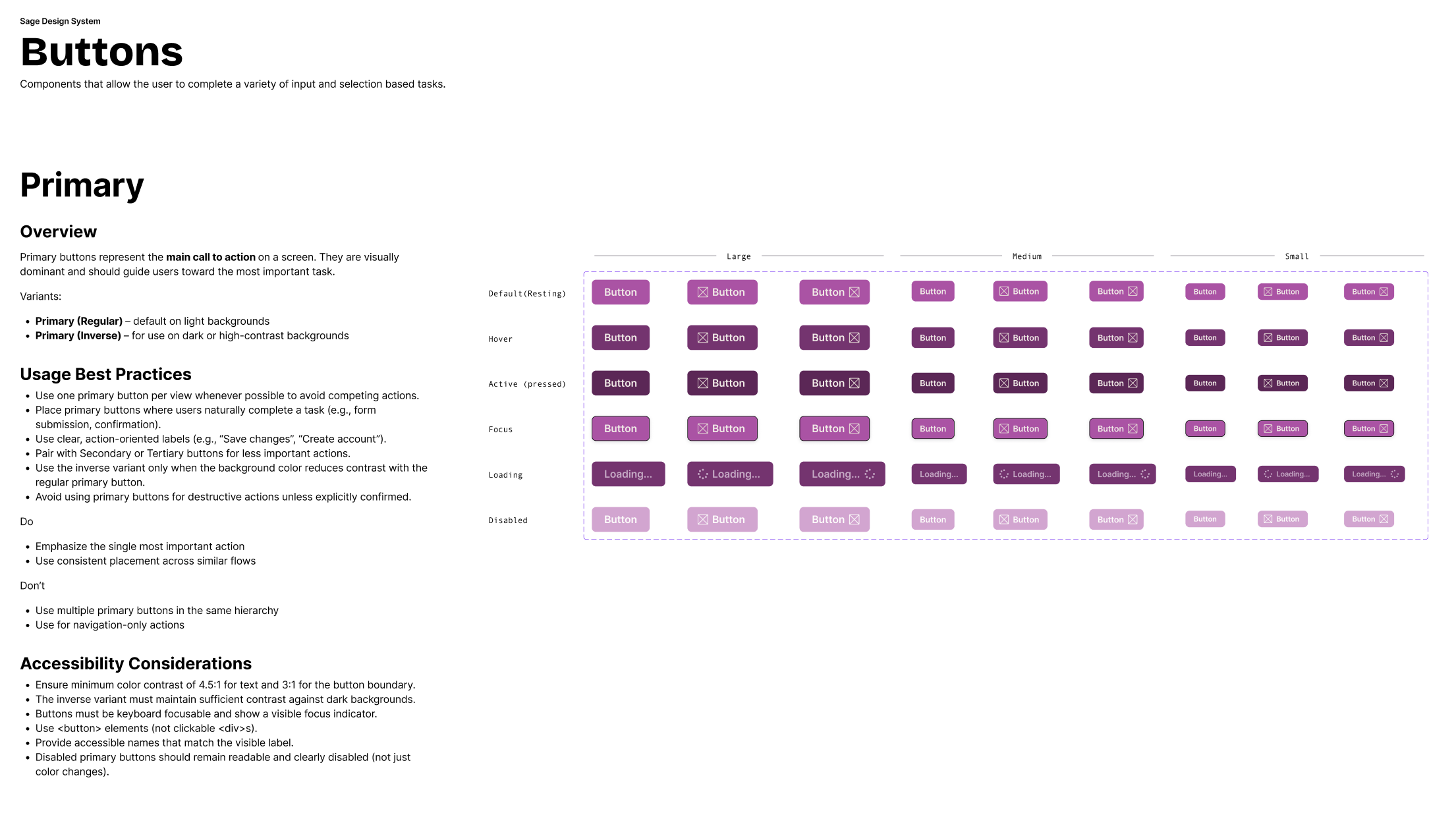
The first move was organizational, not visual. I ran a cross-functional workshop with designers and thought leaders to define who Elo was, since that identity needed to anchor every downstream decision in both product and marketing. The system that came out of it, Sage, was named deliberately for its connotations of wisdom and intellectual authority, giving the brand a throughline instead of two competing voices.
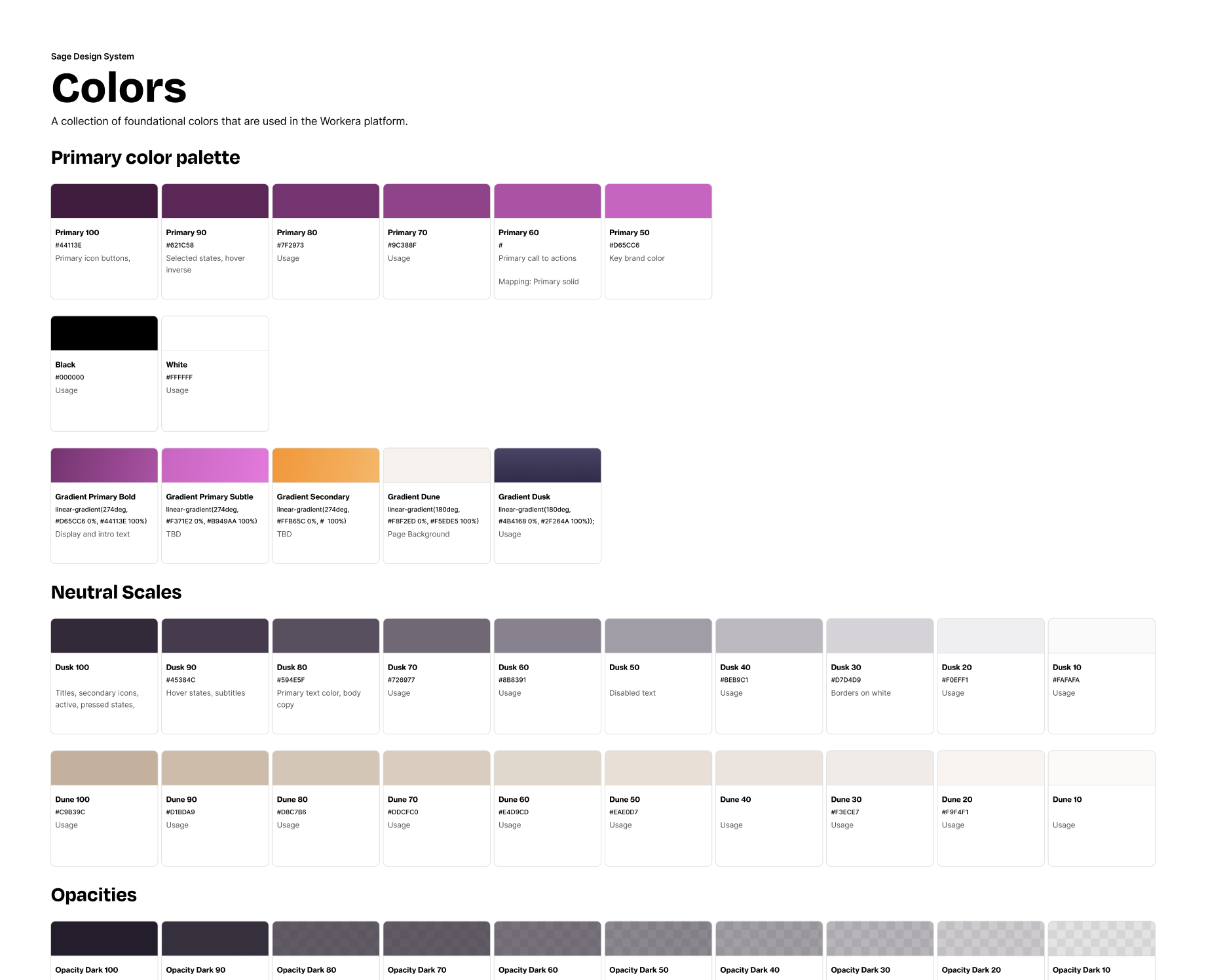
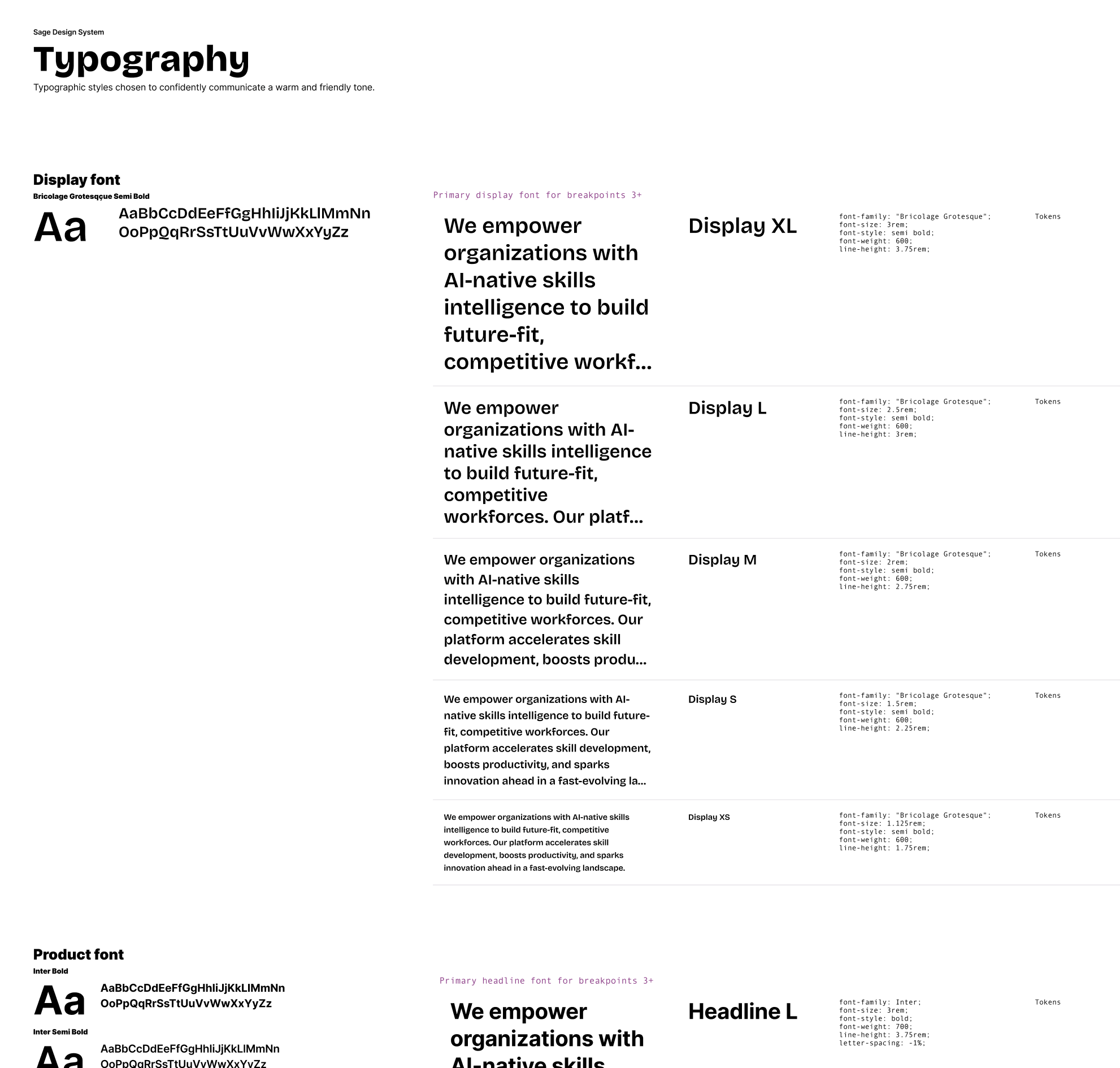
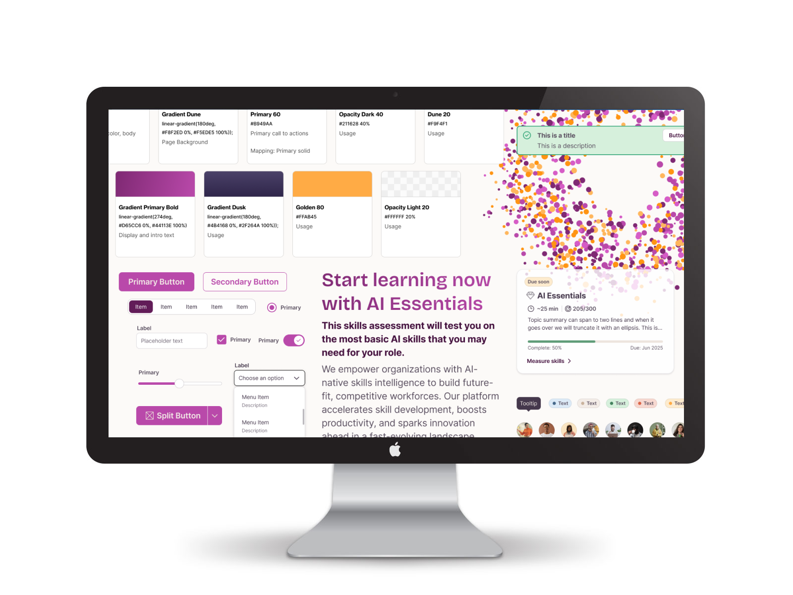
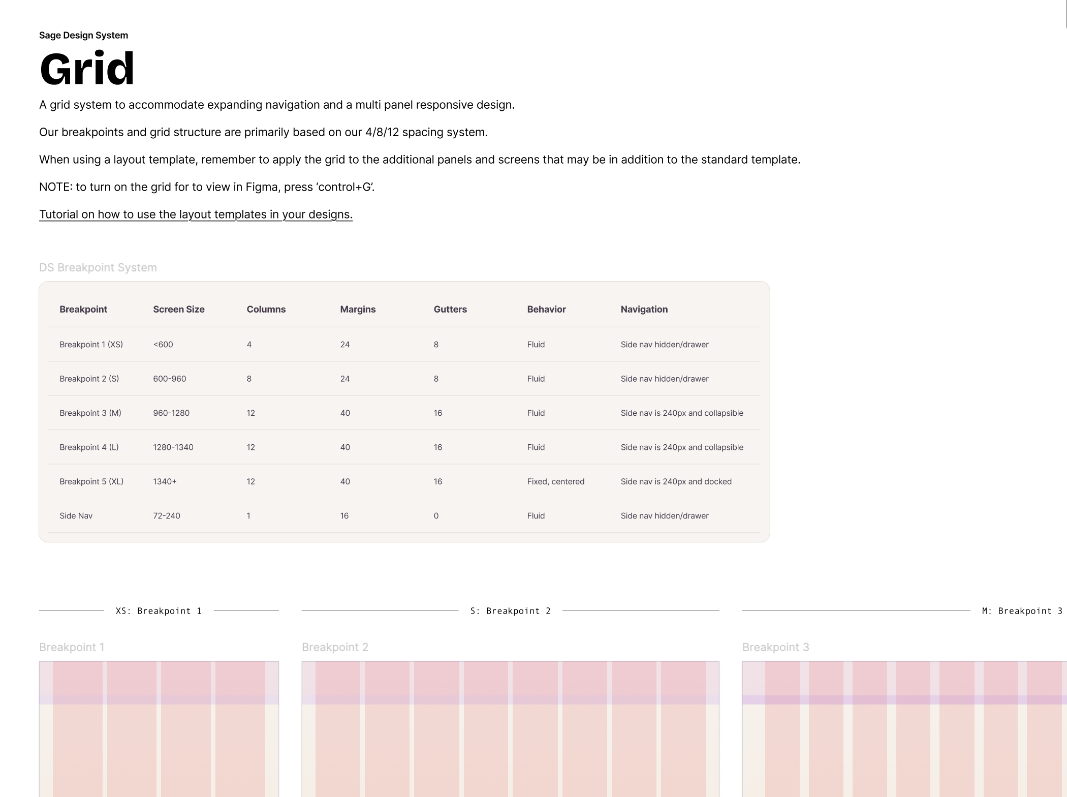
From there, I made the call to scope the system tight. Workera’s product didn’t need, and couldn’t yet support, a sprawling token library, so I kept the variable set intentionally small and built up from base tokens into functional components, then contextual tokens, in that order. That scoping decision is what made adoption realistic: once resourcing came through, I sequenced the rollout in waves, starting with the lowest-risk, highest-leverage layers (typography, spacing, grid) before touching anything customer-visible, then moved into a full color and elevation overhaul, flattening shadows that were causing rendering failures and shifting to a warmer, higher-contrast palette built for a content-heavy product.
Documentation and agentic implementation
I treated documentation as infrastructure, not an afterthought. Every token and component was documented to serve two audiences at once: designers who needed clear usage guidance, and AI agents who needed structured specs they could act on directly. I connected that documentation to Figma’s MCP, which let engineers and agents pull live component specs straight out of Figma into code, instead of working off static handoff docs that went stale the moment the system changed. That kept implementation tied to the actual source of truth in Figma rather than to a snapshot of it, and it meant the system could be built out by agents, not just described to them.
The outcome
Product and marketing now operate from one design language instead of two. That alignment showed up in font licensing savings, faster internationalization, fewer UI defects post-launch, and measurably higher accessibility scores within six months. Documentation built for agents as well as designers also cut down implementation drift, components stayed truer to spec because the path from Figma to code didn’t depend on someone re-translating intent by hand. It also changed how the brand read externally: a more cohesive, credible visual identity became part of the trust signal in later deal and partnership conversations, where design maturity was being evaluated alongside the product itself.
Reflection
The hard call here wasn’t which components to build, it was how much restraint to build into the system itself. A token library that tries to do everything becomes the next thing that needs fixing. Sizing the system to the actual maturity of the product, instead of the maturity I wanted it to project, is what made it durable enough to scale with Workera rather than against it.
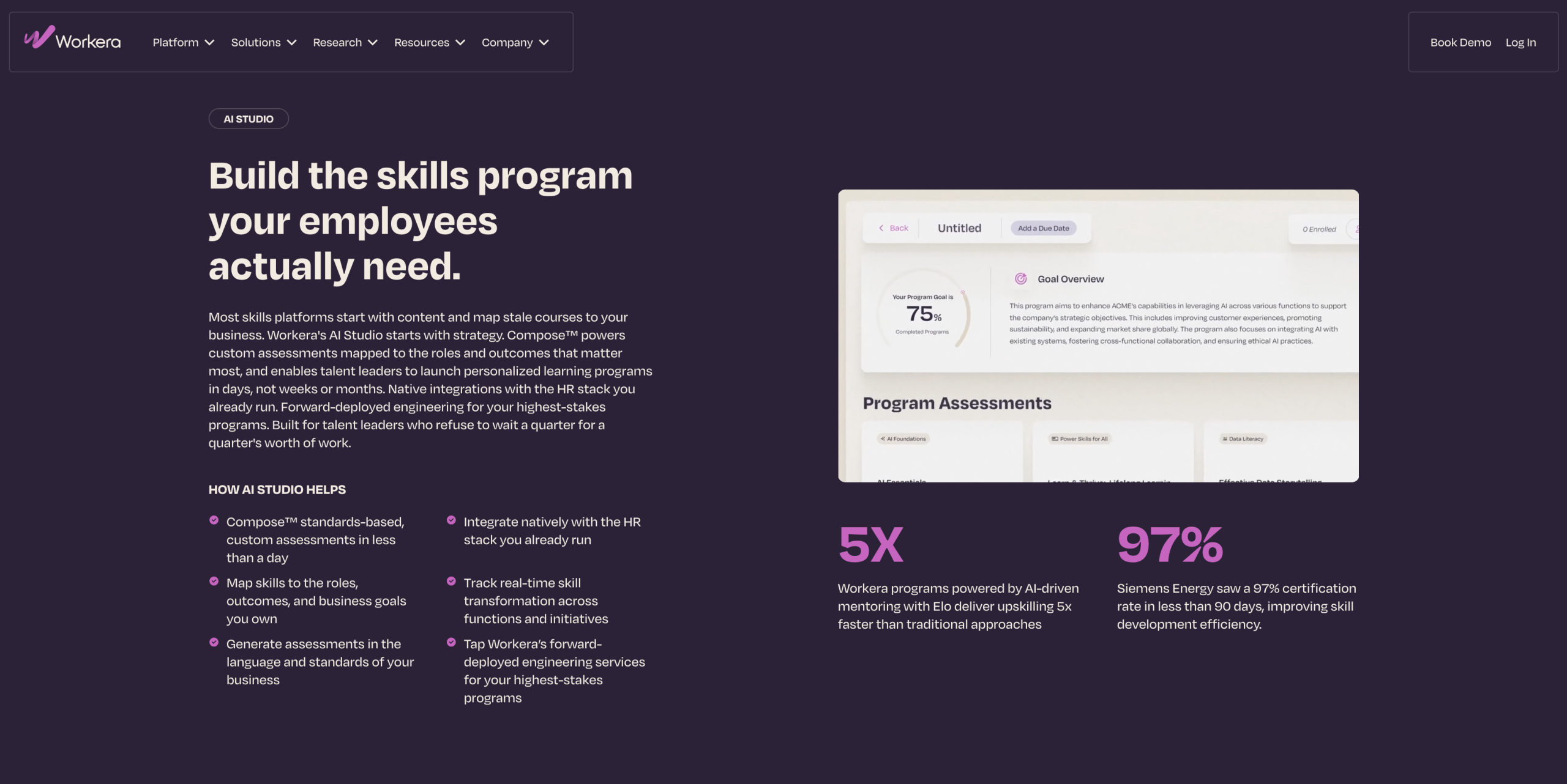
The cohesion between product and marketing establishes trust and brand strength